
Over the past couple of years we have experienced a number of key world events and stories that have triggered vast amounts of data and information outputs – the US elections, the financial crisis, Haiti earthquake, UK elections and the Iceland volcano are just a few that spring to mind.

The latest ‘data’ event is the football World Cup 2010 which kicks off in South Africa in a few hours from now. To mark the start of the tournament I have been trawling the web to unearth examples of the variety of information products and devices news and media outlets, sponsors and visual artists have created to engage and help supporters learn more about the tournament. Some are good, some are bad and some, naturally, are ugly. I don’t have enough minutes in the day to provide narrative or constructive comments for each visualisation so I’ll let you be the judges.
Typically, the examples I have discovered fall in to these categories:
- Match fixtures and tournament schedules
- Guide to the venues and stadiums
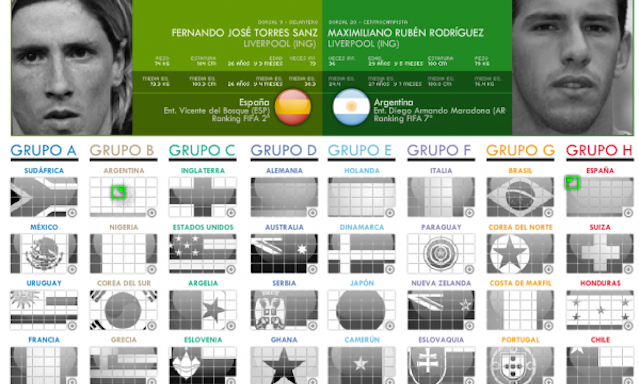
- Group/team/player guides
- Match predictors/team trackers
- World cup history
- Other miscellany…
Because the games clearly haven’t started yet there is nothing that captures results or key stats but I’ll be tracking these developments during the tournament to discover the most innovative displays and designs.
MATCH FIXTURES AND TOURNAMENT SCHEDULES
BBC Match and Fixture Calendar

World Cup Plan by Martin Oberhäuser (via datavisualisation.ch)


Continental (FIFA World Cup Sponsor) Match Schedule

Visa (FIFA World Cup Sponsor) Match Schedule

GUIDE TO THE VENUES AND STADIUMS

La Informacion – Guide to venues (and pointing out Spain game locations)

GROUP/TEAM/PLAYER GUIDES
A wonderful flickr collection of rich, informative colourful graphic illustrations covering information about groups, teams, players and schedules.

Marca player selector and comparison tool

Expresso of Portugal providing a country by country guide

La Informacion – Map of clubs providing players at the World Cup

MATCH PREDICTORS/TEAM TRACKERS
BBC Match Predictor and Team Tracker


Section Design – World Cup predicted by GDP (published in Wired June 2010)

WORLD CUP HISTORY

Fusion Charts – History of World Cup (1930-2006)

La Prensa Grafica – History of countries appearing at World Cups down the years

La Prensa Grafica – Rich illustration of just about every aspect of the tournament (via InspiredMag article by Tiago Veloso)

OTHER MISCELLANY…
Mint Digital’s World Cup data visualisation app for the iPad

The Guardian Fans Network (and associated guide)

La Informacion – Random facts about the World Cup down the years

Castrol Live Tracker – an absolutely bonkers dashboard with all sorts of unusual

Some odd business involving Hyundai donating 1,000,000 balls to Africa – a ball being donated every time someone buys a car… or registers on the site (why the parity?).

And finally, the fashion garment that all the kids are wearing right now… a belt that lets you stick in the scorelines into the buckle.
Football ‘Result’ Belts – ‘Same Shit. Different Belt‘


[I must acknowledge a similar article posted on InspiredMag by Tiago Veloso which (frustratingly!) I came across towards the end of compiling this post. It contains some other great illustrations as well as many of the above.]
