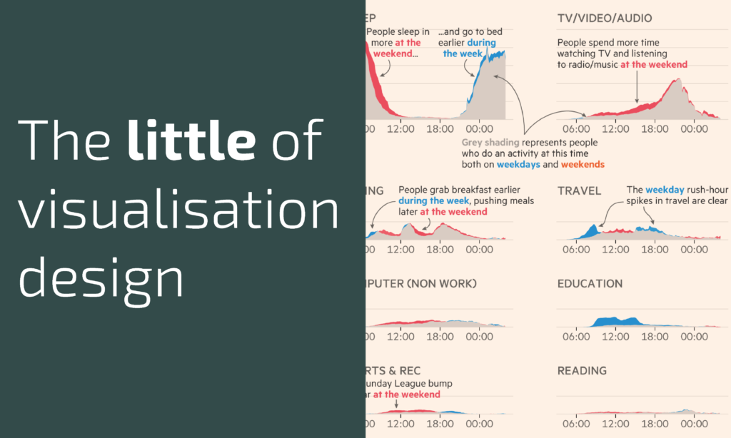
This is part of a series of posts about the ‘little of visualisation design’, respecting the small decisions that make a big difference towards the good and bad of this discipline. In each post I’m going to focus on just one small matter – a singular good or bad design choice – as demonstrated by a sample project. Each project may have many effective and ineffective aspects, but I’m just commenting on one.
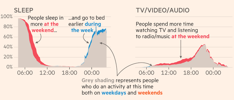
The ‘little’ of this next design concerns using colours to editorially emphasise the most important features of a chart’s display. The work in question comes from John Burn-Murdoch in a Financial Times article titled ‘The truth about weekend working‘. The visualisation is comprised of small-multiple area charts, showing the patterns of how people spend their time across different activity categories over a 24 hour period.
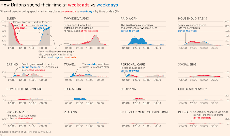
The main editorial perspective picked out by John in this analysis is the difference in activity patterns when comparing weekends versus weekdays. Therefore, the regions of each chart where there is overlap becomes the least important region. To achieve this editorial hierarchy, John relegates the prominence of the overlapping areas by using a neutral and ‘quiet’ grey, and creates visual contrast with the exceptions of weekend or weekday peaks by allocating vivid red and blue tones to expose these shapes.