
This is part of a series of posts about the ‘little of visualisation design’, respecting the small decisions that make a big difference towards the good and bad of this discipline. In each post I’m going to focus on just one small matter – a singular good or bad design choice – as demonstrated by a sample project. Each project may have many effective and ineffective aspects, but I’m just commenting on one.
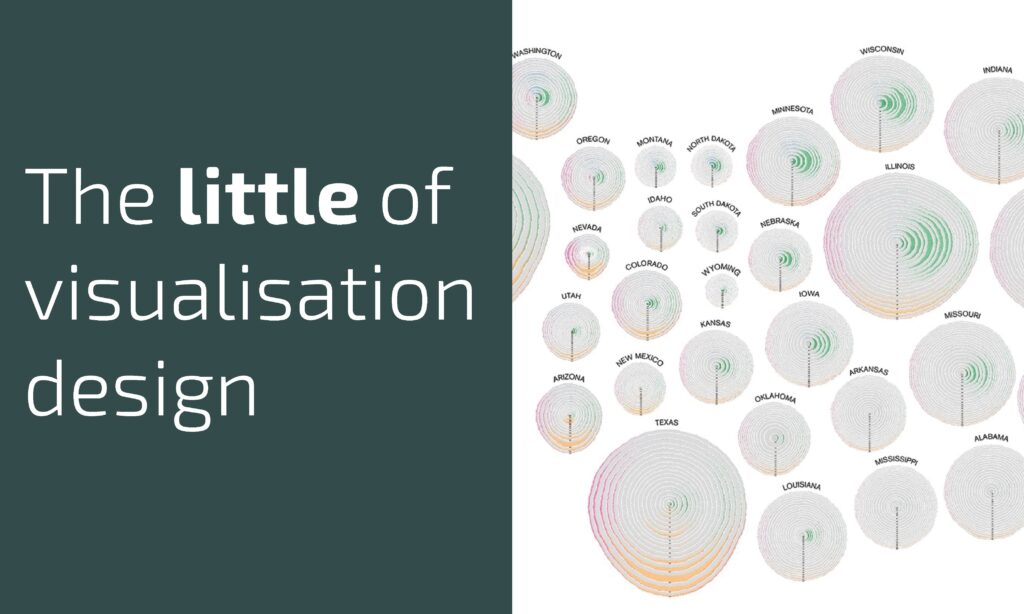
The ‘little’ of this next design concerns the subtle styling of value labels. The work in focus is one of my favourite (ever) visualisation pieces titled ‘Simulated Dendrochronology of U.S. Immigration: 1790-2016‘ and developed by Pedro Cruz, John Wihbey, Avni Ghael, and Felipe Shibuya.
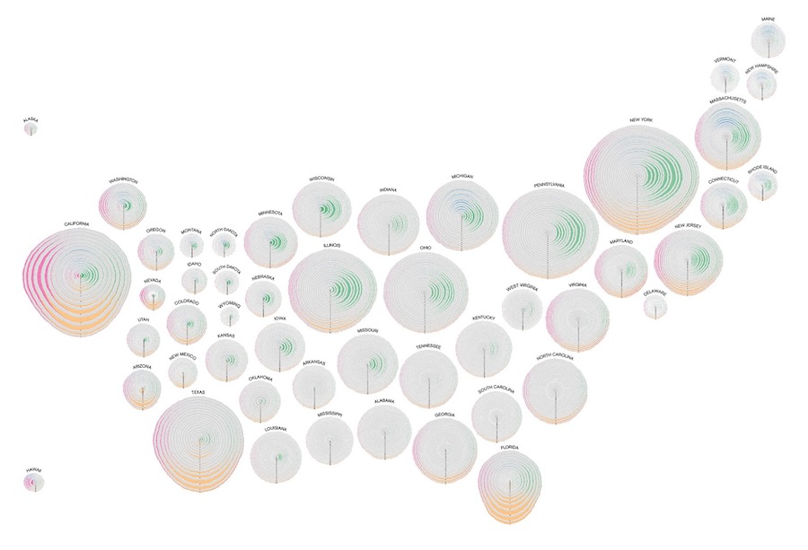
Most who have seen this before will be familiar with the main tree ring view of immigration across the whole of the U.S., but I want to focus on a further variation in this project, assembled by Steve Costa, showing a cartogram of tree rings for all 50 states. One of the little design features I loved about this was the presentation of the state labels in the way they are curved around outer edge of their associated tree ring shape.
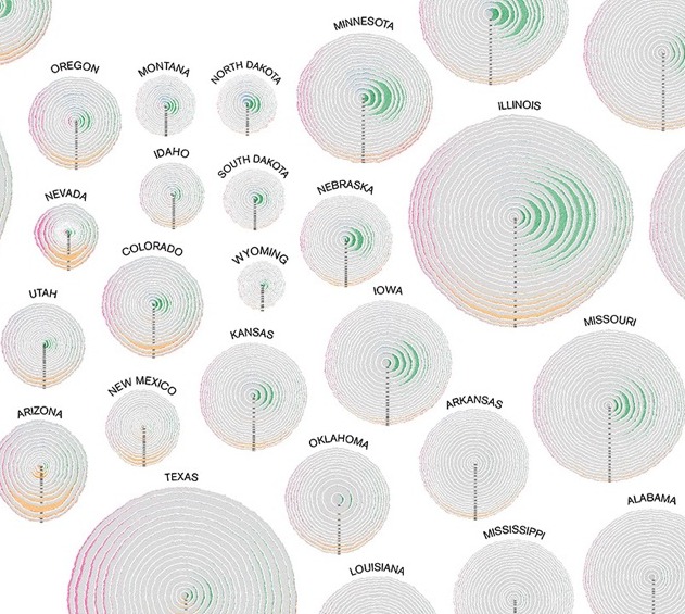
This simple choice seems to create a glue effect, binding the label to its relevant tree ring and eliminating any perceptual doubt about which relates to which that could have been the case with straight labels. It creates more cohesion between the representation and the annotation, rather than making the latter feel like an intrusive, administrative after-thought.