This is part of a series of posts about the ‘little of visualisation design’, respecting the small decisions that make a big difference towards the good and bad of this discipline. In each post I’m going to focus on just one small matter – a singular good or bad design choice – as demonstrated by a sample project. Each project may have many effective and ineffective aspects, but I’m just commenting on one.
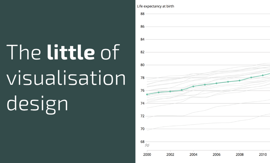
The ‘little’ of this next design concerns another approach to alerting chart readers to the use of a non-zero baseline in a line chart. The chart in question comes from an ONS article ‘Changing trends in mortality: an international comparison (2000 to 2016)‘ and a chart showing the life expectancy trends.
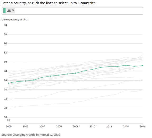
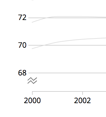
As you will see, the y-axis does not start from 0 years (it doesn’t need to for the representation method nor this subject matter), rather 68 years is the lowest value. Rather than potentially confuse or mislead the audience who may not pay attention to this, the chart employs a zigzag symbol underneath the 68 label to indicate that the y-axis is truncated.