
This is part of a series of posts about the ‘little of visualisation design’, respecting the small decisions that make a big difference towards the good and bad of this discipline. In each post I’m going to focus on just one small matter – a singular good or bad design choice – as demonstrated by a sample project. Each project may have many effective and ineffective aspects, but I’m just commenting on one.
The ‘little’ of this next design concerns potential redundancy in axis labelling. The focus of this piece is a project published by The Pudding, titled ‘The Office Dialogue in Five Charts‘. Unlike previous posts in this series, this piece is not taking a critical perspective, rather I’m exploring some alternative approaches to offer a reminder of the subtleties of choice that exist about seemingly low-level and mundane matters. I really like the project in focus but I’m wondering to what degree the repetition of chart annotation is useful?
(Note: You might need to click on the images to see them in higher resolution)
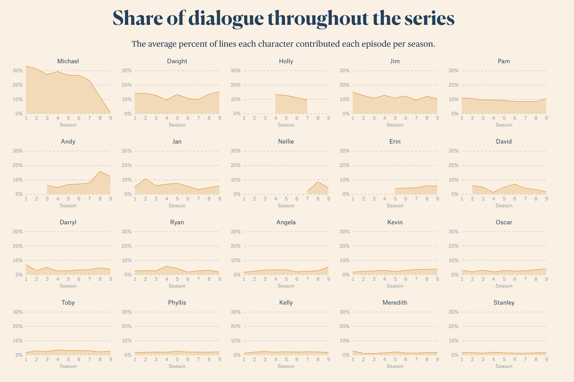
In this series of small multiple area charts we see y-axis interval labels 0% >> 30%, x-axis interval labels 1 >> 8 and the x-axis title ‘Season’ repeated across every one of the 20 charts. This unquestionably aids the direct readability of each panel but much of it could arguably be described as redundant. If we assume that there were no programmatic restrictions (in some situations you might not be able to customise the design of individual charts in a matrix like this) one could just have the first panel in each row showing the y-axis intervals and the first chart only titling the x-axis…

You might need to keep in the x-axis intervals because they don’t have vertical gridlines to aid reading downwards from the first row. As you see below, stripping x-axis interval labels from rows two, three and four makes them a little harder to read. Maybe this is too severe. However, it might also enable the eye to focus less on apparatus and more on observing the patterns in the data – placing more emphasis on ‘the gist’.

As ever the boring tag ‘it depends’ carries as much weight as ever here as does the notion of the goldilocks principle for annotation design – the sweet spot existing between not too much and not too little.
