
This is part of a series of posts about the ‘little of visualisation design’, respecting the small decisions that make a big difference towards the good and bad of this discipline. In each post I’m going to focus on just one small matter – a singular good or bad design choice – as demonstrated by a sample project. Each project may have many effective and ineffective aspects, but I’m just commenting on one.
The ‘little’ of this next design concerns a nice technique for elegantly displaying chart gridlines. The example of this approach comes from an article published in the Guardian about the affordability of homes around the UK.
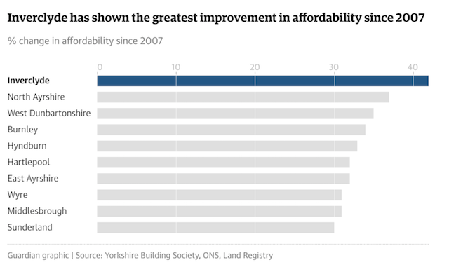
This is a very simple approach whereby the gridline colours take the same colour as that of the chart background. In this case white is used, which means you avoid the visual clutter of visible lines crossing the entirety of the chart space but, as a reader, you still gain the benefit of a more subtle guide to help judge the size of the bars.