
One of the standard pieces of advice I (and most others in a similar position) give to people looking to develop their data visualisation skills is to constantly seek opportunities to practice. Every task is different, every dataset presents new challenges. From small and simple to large and complex, any chance to practice will sharpen the eye and broaden your repertoire of capabilities.
There are of course practice opportunities in the workplace, developing your experiences through working on tasks with fresh thinking, challenging what you have done in the past and being more discerning in your choices going forward. There are practice opportunities outside of the workplace context possibly through pursuing passion projects: acquiring and exploring data about subjects you might be personally interested in, pushing yourself beyond your creative/technical comfort zone and embracing the valuable learning that comes from making mistakes without too much consequence.
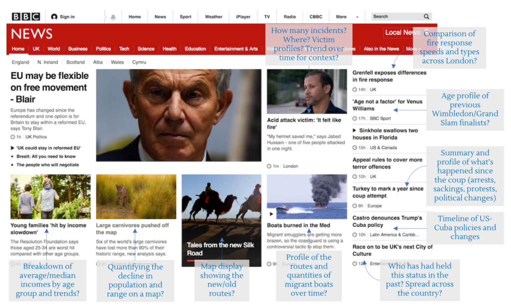
One particular strategy I like to employ (but, hands up, rarely actually find the time to do) is to challenge oneself to occupy the mindset of a journalist. Look at the current news stories and try to imagine what data-driven visuals could be useful to substantiate or supplement a story. You can do this to different degrees of involvement, whether it is just thinking “if that was my story I would have included a graphic to show…” right the way through to finding the angle, sourcing the data and building a solution. If it is the latter, maybe consider imposing artificial constraints on yourself such as fixing your timeframe to a maximum of 6 hours or adopting the constraints of space limitations.
Here’s a small example of this thinking, just showing some notes I applied to a screengrab of the BBC news website yesterday (click on it to see a larger view).
