
This is part of a series of posts about the ‘little of visualisation design’, respecting the small decisions that make a big difference towards the good and bad of this discipline. In each post I’m going to focus on just one small matter – a singular good or bad design choice – as demonstrated by a sample project. Each project may have many effective and ineffective aspects, but I’m just commenting on one.
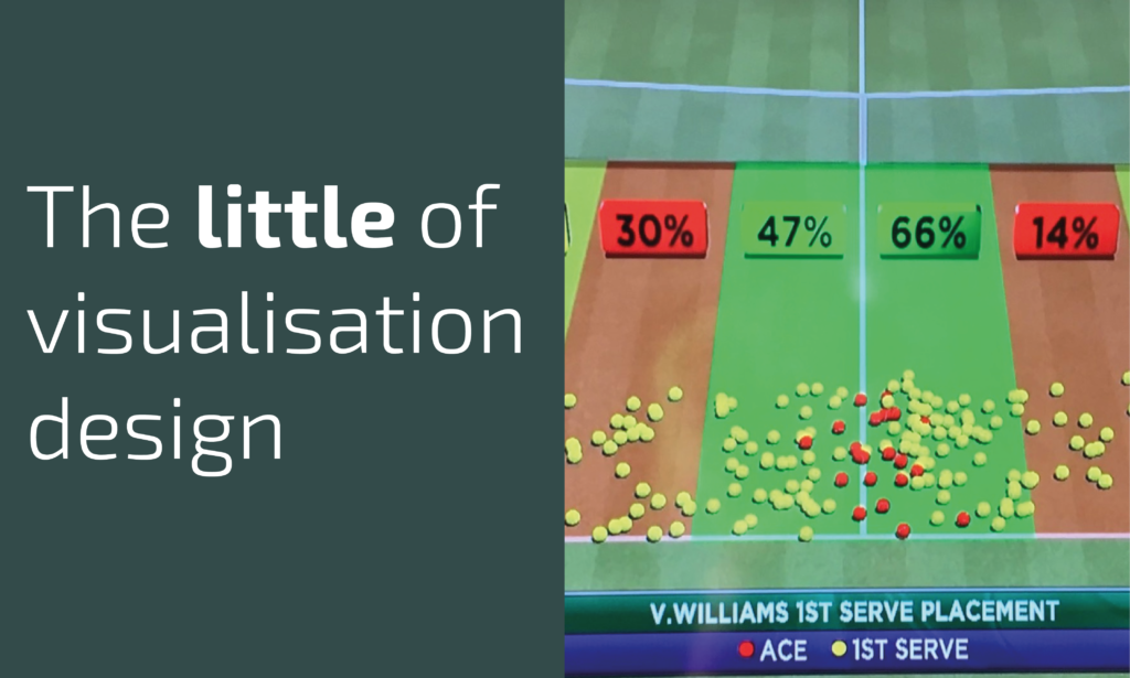
The ‘little’ of this next design concerns the confusion that arises through careless colour choices. The specific subjects here relate to a pair of example charts used on TV during recent Wimbledon (BBC) and Cricket (Sky) coverage in the UK. It is rather uncanny how both examples above demonstrate the same issues, even though they are published by different broadcasters.
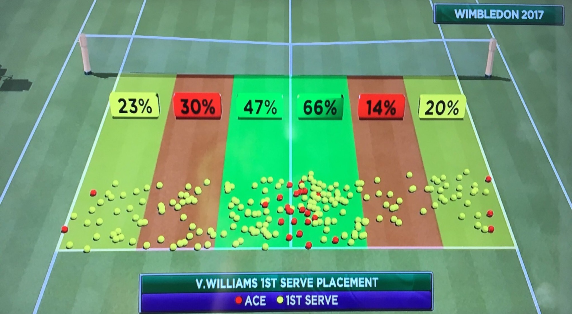
In each of these displays above and below, you will see there is contextual colouring on the ground to provide some notion of whether the tennis serves or cricket deliveries were hitting the right areas. In both cases red, yellow, green are committed to what is essentially the background colouring (btw, the issues of colour-blindness are another matter). The problem demonstrated is the way the red and yellow colours are then re-used to be associated with a second, different meaning in the foreground data layer. In the tennis graphic above, red means an ‘ace’ and yellow just means other serves. In the cricket graphic below, red means ‘edged’ and yellow means ‘missed’.

By associating individual colours with two distinct meanings this causes unnecessary confusion for the eye and the brain to identity and remember what these meanings are as the reader pans across the graphic. A reasonable rule to follow is once you commit a colour to mean something you should preserve this exclusive association within the same view. In both these examples, it would be straightforward to find different visual cues through alternative colours or maybe filled/unfilled shapes to create more distinct representations.
