This is part of a series of posts about the ‘little of visualisation design’, respecting the small decisions that make a big difference towards the good and bad of this discipline. In each post I’m going to focus on just one small matter – a singular good or bad design choice – as demonstrated by a sample project. Each project may have many effective and ineffective aspects, but I’m just commenting on one.
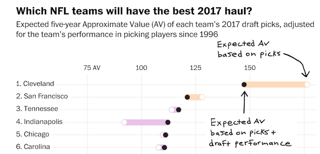
The ‘little’ of this next design concerns a nice styling approach to annotating charts. The work in question was published in The Washington Post by Reuben Fischer-Baum and covers analysis that answers this question: “Does your team botch the NFL draft?“.
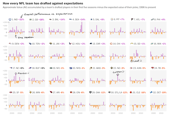
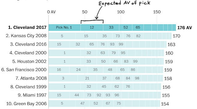
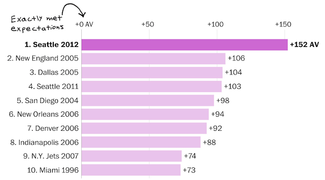
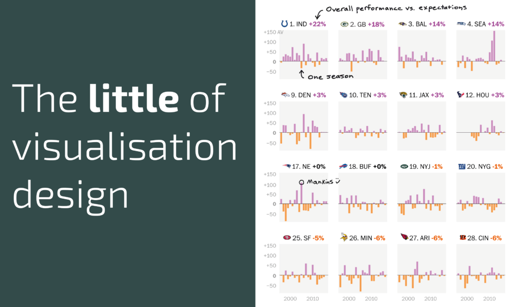
There are many things to enjoy in this project but I was struck by the subtle impact of the hand-sketched style of the chart annotations. As you can see these notations point out tips for how to read the chart but also illuminate certain features of data that are of particular interest and/or offer some domain context that might explain the effect seen.
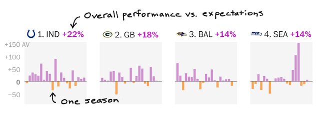
By presenting these annotations in a completely different style to the chart’s standard look-and-feel it creates a neat distinction with, for example, the chart’s value/axis labels. In contrast, these items of chart apparatus are (rightly) relegated to a somewhat utilitarian role with the sketchy notes jumping to the surface, offering small snippets of commentary in written form that you might otherwise verbalise and point to if you were presenting it live. The example shown above is just one of several charts that employ this technique