
I want to reflect on another occasion where the innocent intent of a chart has been at odds with the perceived incompetence claimed by a snarling audience. This is something of a companion piece to a similarly-motivated post I published almost three years ago. I changed the title this time from ‘CONFUSION AND DECEPTION’ to ‘INTENT AND PERCEPTION’ as I don’t think the circumstances have triggered quite the same DEFCON 1 level of reaction, mainly because this is about pizza toppings rather than gun deaths.
To set the scene, below is the piece in question – let’s consider some of the different issues surrounding this piece and its fallout:
1. Subject matter metaphors and imagery
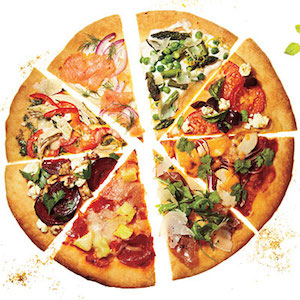
“We need to do a chart about pizza toppings?”. Imagine you are verbally giving this requirement for a visualisation task, instinctively what imagery comes to mind? 100% of normal people are going to say an image of a pizza. I spoke about the pitfalls and benefits of exploiting visual metaphors associated with subjects in my book. There’s no right or wrong, rather it is entirely subjective.
Sometimes it works as an immediate thematic cue for the subject, sometimes it does not work, usually through the misjudging of negative connotations or overly-stretched metaphors. As a designer, it is a natural place to go: as a reader it is a natural place to expect the designer to have gone. If you’re reading about pizza toppings you’re probably going to be surprised if it does not use a pizza as a graphic apparatus to host this analysis.
2. People do not read intros/instructions particularly well, if at all.
If you publicly call out a perceived mistake in a chart and you haven’t read a provided explanation that might offer some context or clarification then you should feel a bit of a plonker. We all do it, I certainly do it as much as others but, sometimes, we just have to take that moment to avoid fixing our attention just towards the bright, colourful shiny thing in the middle of the screen and check that we have read it all.
Ask yourself “am I jumping to conclusions here or is there something I’ve misread or failed to read here that might help overcome my initial confusion?”. Some argue that if you have to explain something it is already a failure. I strongly disagree. Sometimes, sure, but often things merit explanations because many people who could benefit from *the thing* might need explanations. Not all, but many do.

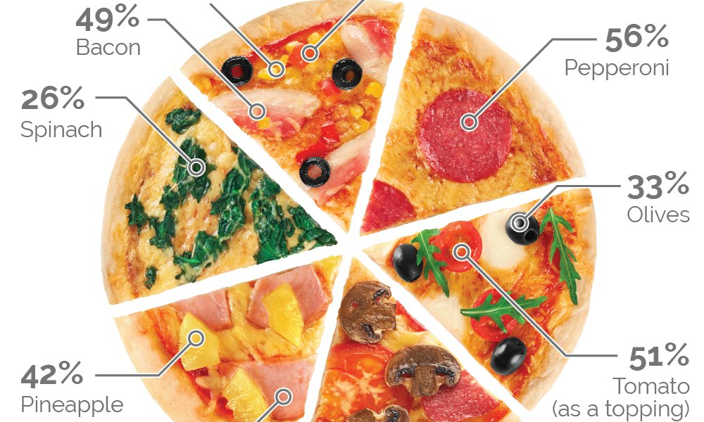
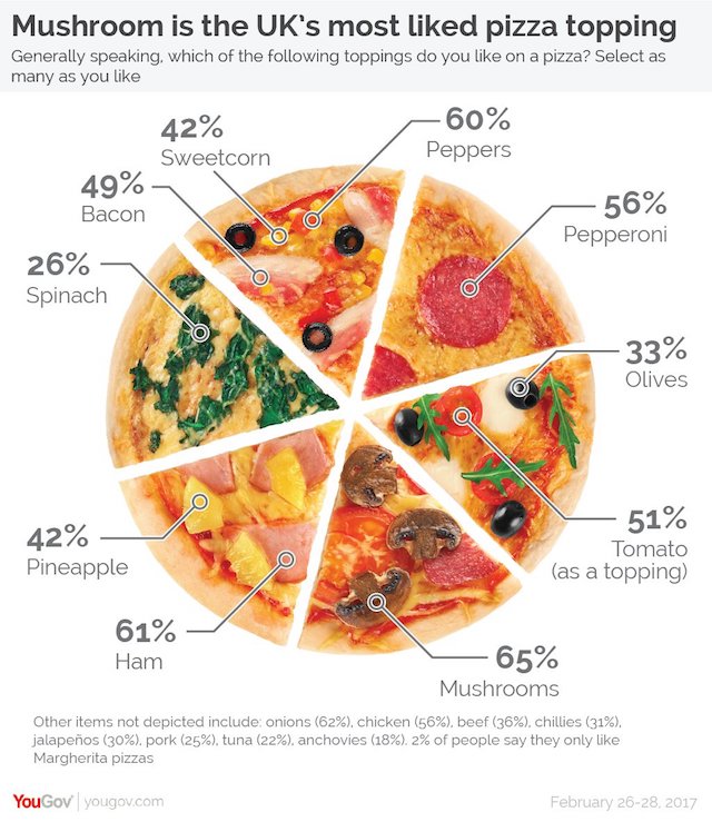
In this case, the intro makes clear that these results are not individual parts-of-a-whole, rather the relative popularity of toppings amongst a series of options from which people surveyed could choose several. Knowing this before twitterising some outrage about the ‘misleading’ pie chart would maybe have allayed some of the noise.
3.Muscle memory of assuming a familiar chart archetype
The key cause of people instinctively misreading the intent of this chart as a pie-chart is due to the exploding appearance of the pizza whole into six distinct pieces, effectively separating each slice from the other through the presence of the white/empty space. This understandably would have triggered people to *initially* read the slices as parts of a whole and then tempted them into associating these with the percentage callout labels seen around the display. As mentioned above, this could have been overcome upon realising the analysis wasn’t offering a part-to-whole portrayal but, nevertheless, there would have been some initial incongruence in perceiving the values displayed against the apparent equal-looking 16.67% splits of the parts.
That said, once you see that the pizza slices are of equal size (just like a normal pizza you order might be pre-sliced and separated out) AND that the call-outs are pointing to individual ingredient pieces, your initial sense of it being a pie chart should be replaced by an awareness that the pizza image is playing more the role of a map, offering a board of different ingredient images to hang the annotated values from.
In this case, the visible slices were pre-existent in the stock photography used for the main image. Had this pizza image been displayed as a whole, complete circle, with no separated slices, or if the slices were more chaotically detached and presented in isolation from the whole, I don’t think we’d be here now.
This is just another example of how little design matters can have a big impact (both positively and negatively) in the eye of the reader.
4. Social media reaction: ‘all pile on!’ outrage-mongery
Not surprisingly, the publication of the original graphic on social media was met with the famously balanced, nuanced and kind manner with which this platform is commonly associated a stream of pitch-fork wielding henchfolk wanting to be the first to get THE viral tweet that secures them some envy-inducing #big #social #media #numbers.
Let’s face it people love nothing more than a bad pie chart. There is no greater open-goal opportunity on data visualisation twitter than the chance to beckon the masses to have a look at the latest ‘dumb pie’.
Have a look at the original tweets replies, though, as well as the follow up clarification. Even IF this had been a badly conceived pie-chart, imagine these are aimed at you: you’d never emerge out from under your duvet! We’ve got to do better than this. We’ve got to be better than this. Let’s do less of this both within and outside the field. Rather than empty your anger reservoirs at this chart design, aim it towards more important matters happening around the world right now: there are British people voluntarily putting mushrooms on their pizzas and they think they are right! Bloody animals.