Yesterday we learnt the terribly sad news of the passing of Hans Rosling. My condolences go out to his family, friends, and colleagues as well as the countless others who were affected by this news.
Robert Kosara has posted a great article of appreciation that I would encourage you to read. Likewise, read this nice account from Francis Gagnon and this post of remembrance from Christopher Ingraham. Elsewhere, the Guardian, New York Times, the FT, and the BBC have very nice write-ups of the impact of his work. I especially like this quote included in the Guardian’s piece, from Claire Provost, a former Guardian journalist who interviewed Rosling in 2013:
“Given the timing, with all the talk about fake news, alternative facts, concern over misinformation and propaganda-by-numbers, Rosling stood for the exact opposite – the idea we can have debates about what could or should be done, but that facts and an open mind are needed before informed discussions can begin.”
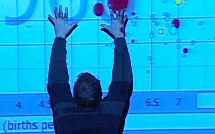
Amongst many career achievements and important contributions, as Professor of International Health at Karolinska Institute and co-founding the Gapminder Foundation, Hans Rosling played a pivotal, inspirational role for many in the field of data visualisation. He was perhaps most famous for his 2006 TedTalk (that they) titled ‘The best stats you’ve ever seen‘. For many people now active or interested in data visualisation, witnessing this video, quite simply, was their entry point into discovering the subject.
To celebrate his legacy, I wanted to use this post to reacquaint or introduce readers to some of the major examples of Hans Rosling’s work so that it will continue to be spread across and inspire new audiences.

