This is part of a series of posts about the ‘little of visualisation design’, respecting the small decisions that make a big difference towards the good and bad of this discipline. In each post I’m going to focus on just one small matter – a singular good or bad design choice – as demonstrated by a sample project. Each project may have many effective and ineffective aspects, but I’m just commenting on one.
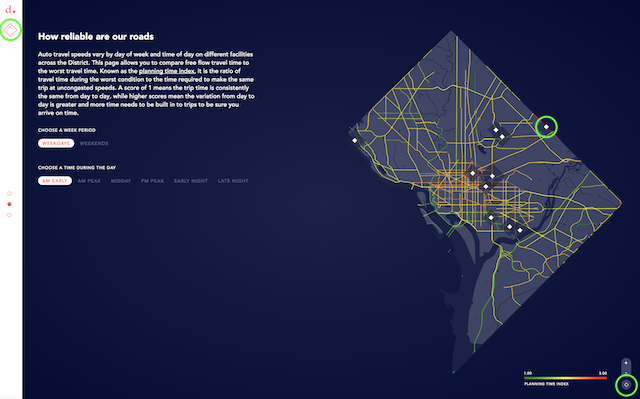
The ‘little’ of this next design is a rather subtle matter concerning an example of how to squeeze out an extra final percent of creative design thinking. The project in focus comes from Dutch studio Clever Franke and is a new tool called ‘District Mobility‘, which visualizes the transportation demands in Washington DC and enables people to understand the bigger picture.
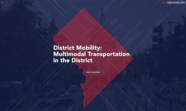
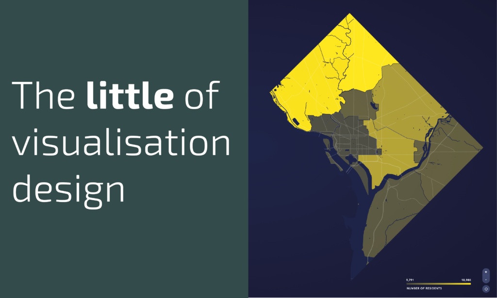
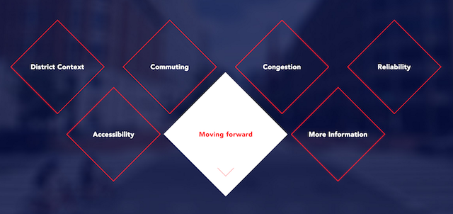
The simple matter to comment on here is the repeated utilisation and symbolic consistency in the use of the diamond-like shape of Washington DC. This is such a fantastic shape to work with, in the first instance, as a region for plotting thematic analysis and, secondly, as a visual archetype for different interactive and data mark features across the entire project.
In amongst the urgency and pressures of developing a visualisation solution, the best designers in this field have that extra sixth-sense and presence of mind to spot opportunities like this: to see patterns of form emerging that can be used in a way to bind a project together as a whole. Sometimes these things can prove to offer only gimmicks or represent metaphors that are too stretched and/or cliched, but when they work well they can really enhance a piece.