

This is part of a series of posts about the ‘little of visualisation design’, respecting the small decisions that make a big difference towards the good and bad of this discipline. In each post I’m going to focus on just one small matter – a singular good or bad design choice – as demonstrated by a sample project. Each project may have many effective and ineffective aspects, but I’m just commenting on one.
The ‘little’ of this next design concerns judging your maximum axis scale when handling outlier values. The project in focus comes from the New York Times in an article ‘Is Terrorism Getting Worse? In the West, Yes. In the World, No.‘. One of the charts looks at the annual trends of terrorism-related deaths in the USA going back to the 1970s.
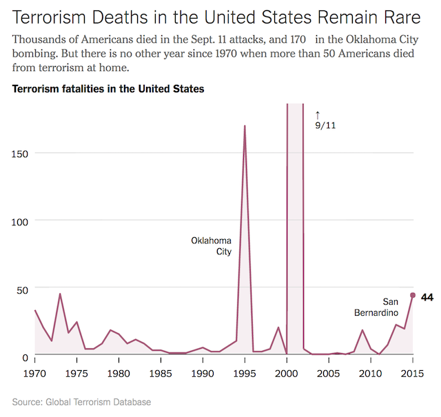
Clearly, in this dataset, the 2977 victims of the tragedy of September 11th 2001 stands as a huge outlier compared to the general trend and one may have normally plotted this chart with a maximum range up to ~3000 to accommodate this largest value. However, in this case, the analysis is focused on the framing the underlying trend which supports the view that terrorist atrocities are of relatively lower prevalence in the US compared to other regions of the ‘west’ (the full article provides prior context for this with other analysis).
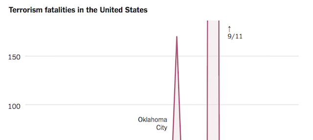
In support of the main point, the maximum y-axis value is astutely capped to accommodate the second highest value (the 170 victims of the Oklahoma City bombings), which slices the top of the rising peak for 2011. The designer is not remotely seeking to downplay the significance of 9/11 nor diminish the significance of the loss of life of every one of the victims, but the point here is to position this count as outrageously larger compared to the norm. Sometimes cropping large values is justified to position them as (legitimate) non-typical outlier values and to allow a clearer perception of the pattern across the smaller values.
