
This is part of a series of posts about the ‘little of visualisation design’, respecting the small decisions that make a big difference towards the good and bad of this discipline. In each post I’m going to focus on just one small matter – a singular good or bad design choice – as demonstrated by a sample project. Each project may have many effective and ineffective aspects, but I’m just commenting on one.
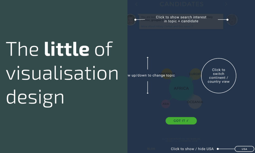
The ‘little’ of this next design concerns a sensible way of offering ‘help’ to readers of a visualisation. I’m referring to a project developed by Accurat in partnership with the Google News Lab called ‘World Potus’. This work was developed during the US Elections to track the popularity, trends and locations of topics people from outside the US were most interested searching about on Google relating to the Election.
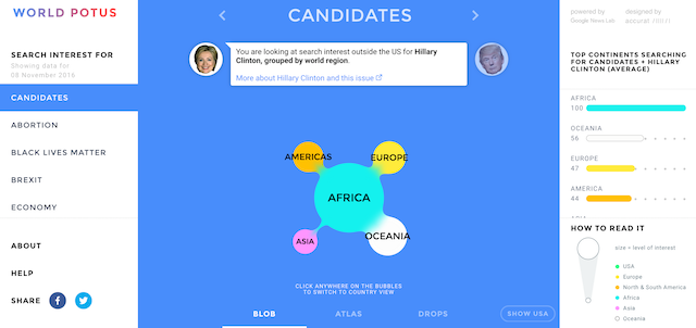
It is often necessary to provide a degree of functional (how to use it) and perceptual (how to read it) guidance with a visualisation and often this involves maybe a ‘i’ or ‘?’ button taking you to a descriptive page of guidance. The problem with approaches like this (hands up, on reflection I’ve done this almost always) is that as a user/reader you are often taken away from the screen of interest. This makes the guidance somewhat detached and relies on your memory.
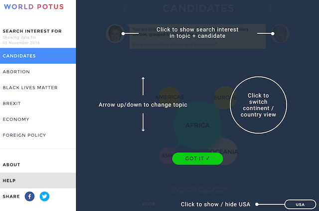
What I liked about the solution in this project was the way pressing the ‘HELP’ button simply overlayed the guidance on top of the screen you were looking at getting help with. This proximity cemented the instruction. Additionally, with a seamless switch on/switch off (or clicking ‘Got it’) you could quickly bounce between the help view and normal view without too much obstruction or delay.