
To mark each mid-year and end-of-year milestone I take a reflective glance over the previous 6-month period in the data visualisation field and compile a collection of some of the most significant developments. These are the main projects, events, new sites, trends, personalities and general observations that have struck me as being important to help further the development of this field or are things I simply liked a great deal. Here’s the full compilation of all my collections.
Earlier in the year I published a collection for the first 6 months of 2016 and now I’d like to reflect on the second 6 months. I look forward to hearing from you with suggestions for the developments you believe have been most significant.
And so, as ever, in no particular order…
1. The Aftermath of the US Election
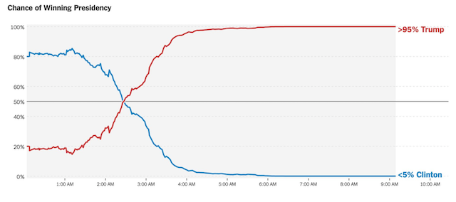
We don’t need a new hot-take/think-piece from me offering commentary on what happened and what happens next but there is clearly much to consider for the data visualisation field in light of the experiences of the US Election. From a purely visualisation design perspective I would argue there was some immense work produced. I’ve previously profiled some of the most notable techniques and talked in specific terms about the reaction to the NYT’s gauge chart. In my roundup of the best visualisation stuff from November I also included a range of other great works surrounding the election coverage. It was unquestionably a huge moment in history narrated, across all media platforms, through the prop of the chart. Its a shame to see some stern finger-pointing from within the design community but I do recognise that (regardless of your politics, let’s face it) the hugely shocking outcome has rocked some peoples’ faith in data through the perceived inaccuracy of many of the forecasts/polling models. The ‘success’ of a visualisation cannot be decoupled from the data it represents but, equally, visualisation can only ever be the medium not the end: readers need to take personal responsibility to spend time reading and understanding limits, assumptions and, above all else, uncertainty/probability. Its all rather complex and I feel we’ll see a lot of introspection happening for a while to attempt to unravel some of this. Dealing with people comfortable with operating in this pathetic era of so-called ‘post-truth’ is one thing, but losing the faith of good people is another thing entirely.
2. The Impact of ‘Dear Data’
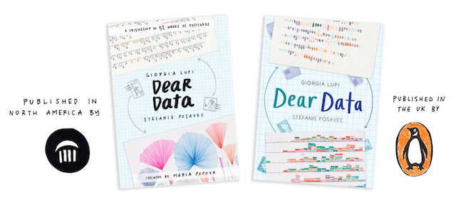
I included the ‘Dear Data’ project in my 6-monthly roundup for the first part of 2015 but I am selecting this project again now because I feel the impact during 2016 has been quite profound and should be acknowledged. The project has achieved great success through exhibitions, spin-off collaborations, award victories, and now topped off with news of the acqusition of the project’s outputs by MoMA (!) for its permanent collection. However, above all else I feel the greatest repercussion of this work is through the inspiration it offers beginners. For many years it has seemed authors like Tufte, Few, and McCandless were the dominant names whose books had offered a first exposure into this field. Well now we need to add Lupi and Posavec. I feel the release of their book has provided an inspiring new window and entry point into this subject for a whole new audience. Its not about tools. Its not about principles. Its about something that is fresh, creative and accessible/achievable for anyone to understand and practice themselves. From my journeys across the year, anecdotally, I feel it has touched young audiences and, unquestionably, a female audience. Although not limited to this project, Dear Data has cemented Giorgia and Stef’s position as visible role models and it is fully deserved.
3. Data Sketches
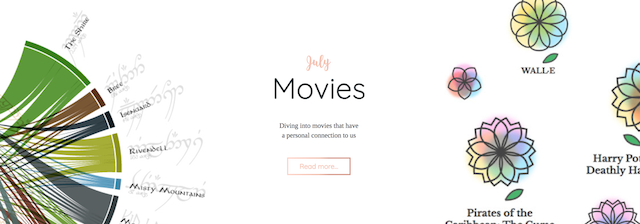
Data Sketches is a monthly collaboration between the hugely talented pair Nadieh Bremer and Shirley Wu. Starting in July, and sharing many of the objectives of ‘Dear Data’ (though it wasn’t explicitly inspired by), each month they choose a topic and aim to have a refined visualisation solution finished by the end of the month. “Within the topic, we’re free to do whatever we want; a perfect opportunity to create, experiment, and have fun.” and as you will see from their growing portfolio of excellent projects, it is quite evident that they are fully exploiting this opportunity.
4. Evolution in Action
Whether it is technically a visualisation or not I don’t really care – as a visual device to reveal or facilitate understanding this video, produced by Michael Baym of Harvard Medical School, was one of the best things I have seen this year. It shows a compelling depiction of evolution in action, demonstrating how ‘disease-causing bacteria and other microbes are increasingly evolving to resist our drugs’. I don’t know how true this is but I liked this line from the Atlantic article covering this piece: “He used to call the dish the Observatory of Microbial Growth (OMG) but more conservative peers forced him to change the name to the Microbial Evolution and Growth Arena plate (MEGA-plate)”. See also Tony Chu’s ‘Antibiotic Resistance Simulation‘
5. Ship Map
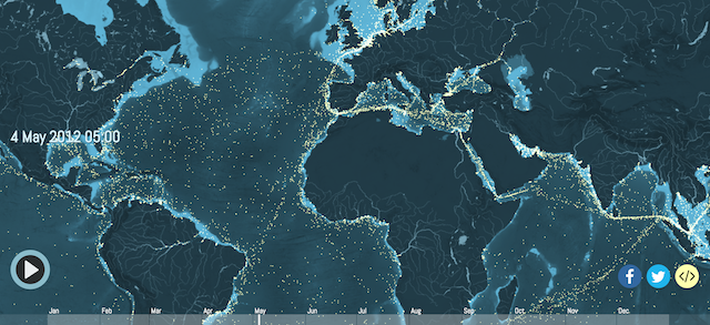
Not much depth in comment required to justify my inclusion of this work other than to say I really loved it. Created by Duncan and Robin from Kiln in partnership with the UCL Energy Institute, it offers a visual window to see ‘movements of the global merchant fleet over the course of 2012’. This is data I’ve never seen visualised before (I’m sure some will correct me!), it is elegantly produced and hugely addictive to sit, watch, and search for avenues of intense shipping and outliers alike.
6. Profiling the Parks
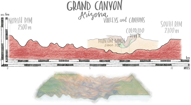
Profiling the Parks is a wonderful hand-drawn video produced by RJ Andrews that presents some fascinating data driven insights about the US National Parks. RJ describes the motivation for the project emerging from a visit to Yosemite, “I tried to picture the Yosemite valley compared to Zion, my favorite Park. Yosemite felt taller (it is) and also wider (yup) – but I couldn’t really tell by how much. I also had no idea which park floor was at a higher elevation. Read more about the background to the project, the methods used and some nice mood board references.
7. Jonni Walker
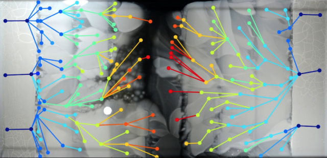
There are many incredibly smart and talented people pushing the limits of what tools like Tableau can achieve. Each day I see something new being produced that makes me feel increasingly inadequate and driven to find out how they have ‘done that’. It therefore feels rather unfair to shine the light on just one person but I came across Jonni Walker’s portfolio of work this year and feel it is really outstanding. He’s doing things in Tableau I’ve rarely seen before with such creativity and with an aesthetic you might normally associate with that of centres of excellence like National Geographic magazine.
8. ‘Joy Division’ Charts
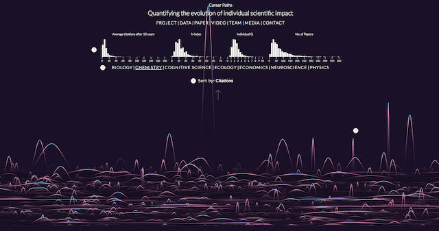
This is a mention for the first of two techniques I’ve seen popping up in a few places recently. I’m terming them ‘Joy Division’ charts, which is quite lame really, but captures my instinctive visual association with the famous cover design of Joy Division’s ‘Unknown Pleasures’ album, as designed by Peter Saville. Some have termed them 2.5D charts, others horizon graphs, but whatever the name I feel they offer a neat spatial solution to highlight the peaks of change over time when you have many concurrent series/categories to display, with opacity helping overcome any occlusion caused by intrusive shaped values. They have been deployed in different ways to show patterns of insults, the evolution of scientific impact, and for plotting the peaks of political support across America.
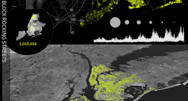
9. Map Containers
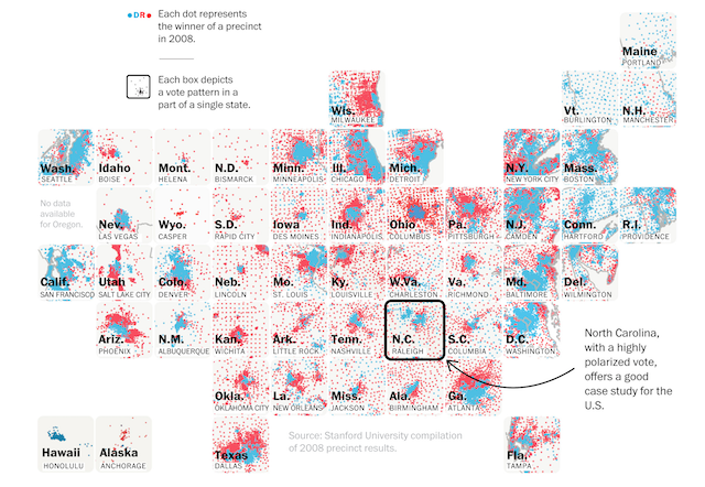
The visualisation work produced by the Washington Post this year has been particularly exceptional, even for them. With as broad an array of different techniques being used as you can almost imagine, (including rare sightings in the wild of things like the Marimekko), one approach I have seen them use on several occasions (here, here and here) has been a variation on the grid map/tile map whereby the individual geographic containers have hosted smaller charts. The ‘container’ attribute is without question my favourite encoding device of the year (try it! it can be quite liberating to not be bound by axis scales) and I really like this approach that blends the advantages of small multiples with the best-fit properties of geographical layout.
10. The NYT’s Composite ‘PhotoVizzes’
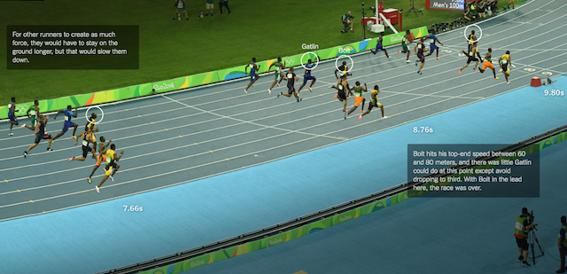
(“Oh, he’s profiling the Washington Post and New York Times again”. Yes I am, shut up, make your own list!) With the dominance of the US election coverage it is easy to forget the breadth and quality of visualisation-based reporting of the Rio Olympics by the New York Times. Feast your eyes on this surely-2017-award-winning collection of work that, again, sees them innovating in staggering new ways. I loved the devilishly simple but compelling interactive that randomly simulates how fast an Olympian could travel from your house to nearby locations based on the distances of their specialist events. It makes you feel super slow and inferior as a fellow human being but that’s ok. The works I most loved, however, were the composite ‘photoviz’ style stories showing the key stages of a race or performance in a single merged, annotated photo image.
Special mentions…
Here are the other highlights from the second half of 2016 that deserve a special mention:
Information+ Conference | A brand new conference for 2016, this was one of the few events I attended so am biased but I thought it offered a super blend of speakers that few others have attempted. Robert Kosara has a nice selection of some of the headline talks
The Great Animal Orchestra | This is such a wonderfully absorbing experience, developed by the Fondation Cartier pour l’art contemporain unveiling “the mysteries of the acoustic harmony of the animal kingdom, offering an unprecedented interactive experience that reveals the ecology of the soundscape and the forces behind it”
Chart Chooser/Flash Cards | I include these developments – packs of custom designed cards to assist in selecting different visaulisation methods – with a mixture of envy and satisfaction because I too was in the early stages of working on such a thing but Stephanie and Jon/Severino (and collaborators) beat me to it! However, they have done a great job and I’m sure they will be successfully adopted by many
A Timeline of Earth’s Average Temperature | A typically exceptional explainer from Randall Munroe showing the disturbing story of the increasing temperature
Orchestra guide | Technically from May but I only came across this (I think!) during the second half of the year, an excellent visual device used to help guide audiences of the Toronto Symphony Orchestera through the music being performed
(Translated) ‘Berlin-Marathon 2016 – Your city is going fast’ | A super nice animation simulating runners of the Berlin marathon working their way round the course at the range of different speeds you would expect
Income Inequality maps | Stunning large prints 3D maps created by Herwig Scherabon visualises income inequality in Los Angeles, Chicago and New York
