
This lesson draws from a 2011 article in The Atlantic ‘Remembering Bruce, the Mechanical Shark in Jaws‘ and was referred to in the third chapter of my new book, where I discuss the matter of establishing your task or project’s ‘circumstances’ – an understanding of the freedoms and constraints that exist within and around your process of creating a data visualisation.
One of the points I made in this passage in my book was about recognising the value, in many cases, of the existence of limitations and constraints in your process. Often such restrictions can prove to be a positive influence. To illustrate this argument I discussed the circumstances faced by Director Steven Spielberg during the filming of Jaws.
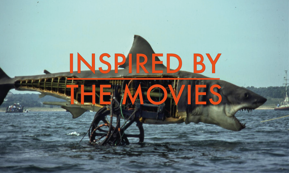
The early attempts to create a convincing-looking shark model proved to be so flawed that, for much of the film’s scheduled production, Spielberg was left without a visible nor viable shark prop to work with. Such were the diminishing time resources that he could not afford to wait for a solution to film the action sequences so he had to work with a combination of props and visual devices. Objects being disrupted, like floating barrels or buoys and, famously, a mock shark fin piercing the surface, were just some of the tactics he used to create the suggestion of a shark rather than actually show a shark.

Eventually, a working shark model was developed to serve the latter scenes but, as we all now know, in not being able to show the shark for most of the film, the suspense was immeasurably heightened. Indeed we don’t even see Jaws until that famous moment when Chief Brody is casually throwing bait into the sea and comes face-to-face with his nemesis, leading him to the conclusion that they might need a bigger boat.

The necessary innovation and improvisation that emerged from the limited resources and increasing pressure led to a solution that made it one of the most enduring films of its generation. Indeed, it was arguably the BEST solution, one that would have surely transcended all other options even if there had been freedom from any sort of constraint.
The key message here for data visualisation practitioners is to embrace the constraints you face. Exhaust the options that exist in any reduced possibility space you work within. I often hear frustration voiced by delegates or students that they don’t have tool X or talent Y to truly express their work in the creative way they would desire but, in my mind, true creativity is heightened when obstacles are present. I’m sure most of us face restrictions in most of our work but perhaps, for the sake of practicing, consider working on personal projects within artificial constraints of perhaps fixed-size layouts, print-only conditions, or limited colour palettes.
Featured image taken from ‘Screen Prism‘
Update: This was going to be the first part of a series of posts about how data visualisation can be inspired by/draw lessons from the movies. I’m killing the series after just this single pilot episode because, whilst I have *lots* of ideas around this theme, I feel it lends itself better to a talk/presentation format rather than written blog posts.