

Of all the graphics produced before, during and after the election (a selection here) it is fair to say the decision by the New York Times team to use ‘gauge’ charts caused quite a stir. For data visualisation purists, the gauge chart represented, on the face of it at least, a fairly controversial and surprising choice.
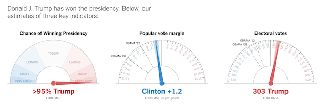
One of the primary arguments against using gauges is that they represent a faux-mechanical means of showing just one number against a scale, taking up a disproportionate amount of space to do this. I would certainly acknowledge that I am not a fan of the gauge as a charting device, it always feels to me as being representative of a desire by people to try something cool, to create a skeuomorphic solution just because they’ve worked out how, not because they should.
However, let’s pause and think about why the gauge was not just a valid choice but actually an extremely astute one, a decision amplified by the story that unfolded on the night. This was probably the only and best case reason to use one.
Unlike most applications of gauges, used to display a fixed single value, those used on election night were used to show live data. They were also used to convey the notion of swing (the very essence of the evening’s proceedings), to show progressive movement along the scale and to also indicate levels of uncertainty. (You could argue that a linear gauge might have been more efficient in its use of space but I would guess that the mechanics of the radial gauge probably facilitate a smoother needle motion).
The main backlash appears to be concentrated on the jitter effect used to display uncertainty (see here, here, here).
Speaking to Gregor Aisch (one of the co-authors alongside Nate Cohn, Amanda Cox, Josh Katz, Adam Pearce and Kevin Quealy), he was able to clarify/confirm the thinking behind this jitter. I’m paraphrasing his response but here it is in a nutshell:
- To help determine the degrees of uncertainty, simulations of a couple of thousand outcomes are run and the count of the outcomes in which either candidate is winning which can be translated in to win probabilities. This is especially necessary early in the night when there are very few votes counted and many eventualities still possible.
- Taking the median outcome from these simulations – itself only representative of one of the possible outcomes – and plotting this as the gauge position would imply some degree of certainty when it did not exist.
- The jitter movement was programmed to convey uncertainty, with the needle randomly moving positions across and within the 25th and 75th percentiles of all the simulated outcomes. This represents the range of 50% of the most likely outcomes of the election night, centered around the median.
So what we are seeing here is uncertainty expressed through motion. A single value would have implied certainty so it was more responsible to show a significant sense of the uncertainty. Of course methods like banded colour regions around the needle could have been employed but that would have probably left something of a mixed visual metaphor mishmash.
As Gregor observed, ‘peak freak out’ about the gauge coincided with the 9pm movement away from Clinton and towards Trump:
“When it comes to important events like this particular election, uncertainty makes us feel very uncomfortable. A display that shows a “narrow but persistent” lead for Clinton makes people feel safe. But one that keeps swinging back and forth into a Trump win (and thus truly shows how close this race really is) does not.”
My own view is that the negativity expressed towards the jitter was a visceral reaction to the anguish caused by the increasing uncertainty of the outcome, heightened by the shocking twist in events during the night. From a visualisation practitioner perspective as well as that of the anxious viewer, I found it an utterly compelling visual aid. When they make the movie about this past week, this will surely be one of the absolute go-to displays to recreate the story of the night.
There’s also something here (picked up by many others so not an original proposition) being exhibited about the widespread misunderstanding of probabilities. Perhaps visualisations create an implication (and even an expectation) of precision, regardless of any measures to provide caveats about the underlying models they portray. Perhaps we need to redouble our efforts to think about how we show fuzziness in numbers. We’re always so caught up in discussions about which encoding methods lead to the greatest precision in data discernibility yet that is not always the goal of the visual.
Update: Gregor has compiled his own post offering reasoning for the gauge chart: ‘Why we used jittery gauges in our live election forecast‘