
This is the latest in a series of short articles titled ‘six questions with…’. The purpose of this growing collection of interviews is to provide a conveniently sized platform to offer perspectives about data visualisation-related topics from professionals within, around or outside of the field, spanning different industries, backgrounds, roles and standpoints. The first ‘series’ of interviews emerged primarily from research on my book, whereas this new series is much more open in scope so I will be accessing perhaps a more varied set of voices.
This latest interview is with Mirko Lorenz a journalist turned information architect thinking about and actively working on software to be used in newsrooms. Included on his CV is his role as co-founder of Datawrapper.
Q1 | Datawrapper has been around for a while now. Thinking back about the beginning: How did the idea and desire to create the tool first come about?
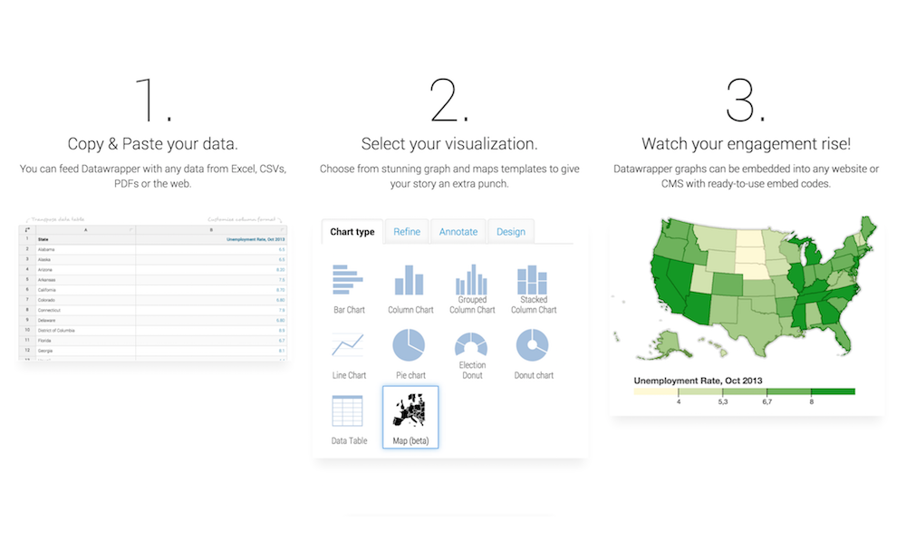
A1 | The initial idea was simple, getting to what the tool can do today needed some stamina. The idea was to simplify how anyone creates charts. At the time we approached the project with a mix of missionary zeal and not knowing how complex simplicity is. At the time most journalists had few options to create charts or maps themselves, at least not under the always present time pressure of a newsroom. Almost everywhere they relied on specialized graphic editors. Yet, most newspapers did not have a full graphics team on staff. Today Datawrapper is a real company, has clients around the world.
Q2 | As a journalist, how would you explain why to use Datawrapper today? In the context of today’s myriad offering of different tools and applications – a market still somewhat characterised by constant flux?
A2 | Datawrapper aims to be a quick, simple, swiss-knife for charts and maps. Datawrapper doesn’t have myriads of chart types or options, but a focus on the most common ones. Plus we really care about making the tool easy to use. This is why we put a lot of work into basic chart types, because those the ones journalists will actually use every day. For example, an annotated line chart that shows the development of the revenue of a company. Or a map that compares GDP growth for different countries, produced in less than five minutes with a bit of experience. Our goal for the next phases is to step by step increase the quality even further – to eventually help to produce the best line charts, bar charts possible. With Datawrapper – at least so far – we achieved to keep it simple to use. You don’t need a big manual to create a chart or even a responsive map.
Q3 | What has been the best demonstration of the Datawrapper’s value? Has there been a situation where you thought ‘that single use case justifies all the hard work we put into creating this tool’?
A3 | That single development are the numbers we have achieved by now: Roughly 60.000 registered from all around the world have created more than 600.000 charts. Some have created hundreds of charts in less than a year. And because quite a few of the charts are published on news sites the number of chart views has skyrocketed. Although we are a super-small company we serve 40-50 million chart views, per month. The value is simple: If you build a tool that is usable the impact can be huge.
Q4 | With your data journalist hat on, what do you see as being the biggest changes you have seen over the past few years?
A4 | There has been a 10x moment in data visualization. Today, there are 10 times as many journalists creating charts than just five years ago. We had a 10x moment in journalism before: When the internet first started, all of a sudden there was an order of magnitude more people that could create and publish articles. And, most importantly, actually reach a sizable audience. The same thing is happening with charts. Just a few years ago, only very few experts worked on data visualizations. The range of what we can do today is amazing: From quick chart production to big one-off visualization projects. Data is gaining importance as a part of reporting – and that’s a good development.
Secondly I get motivation and joy from seeing people do good work. Julius Tröger from Germany is one example, John Burn-Murdoch from the FT another. Georgia Lupi and Stefanie Posavec. The amazing work from Gregor Aisch at the NYT. I am aware I am doing injustice to quite a few more people who are equally contributing. But it’s just to illustrate how I try to keep track of changes: By watching people do good work.
Q5 | We appear to be experiencing (what some have termed) the post-truth era. In your view, what responsibility should data journalism take (if any) for what has happened and what role should it take going forward to address some of the problems we see?
A5 | I think that data and data visualizations can help to get facts straight. But just like all other forms of communication, you can use them to distort, to hide, to twist the narrative. The “New York Times” had this outstanding example on how people with different views and political orientation can look at the same data.
Although I’m happy we can have a positive impact here: With Datawrapper, we try to make it as hard as possible to take data and create misleading charts with it. For example, it’s not possible to create bar charts with cropped axes. From time to time, users ask us to add this feature, but we never have and we never will.
Q6 | What is the single best piece of advice you have been given, have heard or have formed yourself that you would be keen to pass on to someone getting started in a data journalist or visualisation-related discipline?
A6 | Use data visualizations like a camera. Do not approach every visualization like a big project. Instead: Take many “shots”, try to find the best perspective. Often there are many. Eventually eventually you create something new, revealing. This is true for writers, for photographers, filmmakers and equally for the day-to-day work of visualization.