

This is part of a series of posts about the ‘little of visualisation design’, respecting the small decisions that make a big difference towards the good and bad of this discipline. In each post I’m going to focus on just one small matter – a singular good or bad design choice – as demonstrated by a sample project. Each project may have many effective and ineffective aspects, but I’m just commenting on one.
The ‘little’ of this next design concerns the challenges of handling long labels. In this post I’m possible breaking the theme of this series as I’m not so much offering a solution, rather more a ‘heads up’ to flag the possibility of this issue in your work. I’m referring to one of my own recent projects here, ‘Filmographics‘, looking at the ebb and flow of the fortunes of actors’ movie careers. As you can see in the screen shot below, when you choose an actor from the menus at the top an illustration of their face is displayed in the page body and their name is presented within this image.
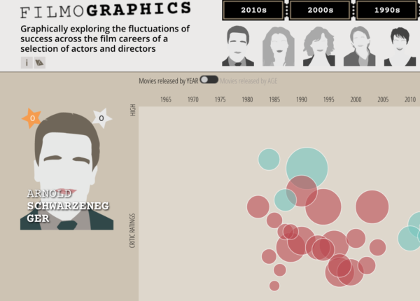
The challenge faced in this case was judging the best font size for the actor’s name label within the (self-imposed) space constraint of the image width. We found a nice size for working with 59/60 values but then we had Arnie: at 21 characters in length, ARNOLD SCHWARTZENEGGER would be the single instance whereby the preferred label font size would cause the surname to be split over two lines. To make it small enough to accommodate Arnie would have the consequence of the name’s being (in our view) an insufficiently prominent title/identifier for all the other actors in the dataset.

In the end, with time running out, we made a decision to accept the rather inelegant compromise of sticking with our preferred font size that would be suitable for all except Arnie: ‘Good enough’, ‘It’ll do’ is often a call you have to embrace when time resources diminish.

With the benefit of hindsight we maybe could have looked to programmatically handle a custom font size for Arnie alone. We could also have handled the placement of the actor’s name entirely differently so as not to present us with a challenge of dealing with this spatial constraint. The main point to make here is to reinforce the importance of developing a deep and early acquaintance with all the physical properties of your data values, not just the range of quantitative values you’re facing but also the length of potential labelling assets.
It’s the little things like this that cause the big headaches.