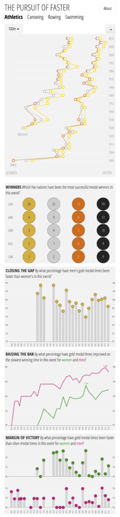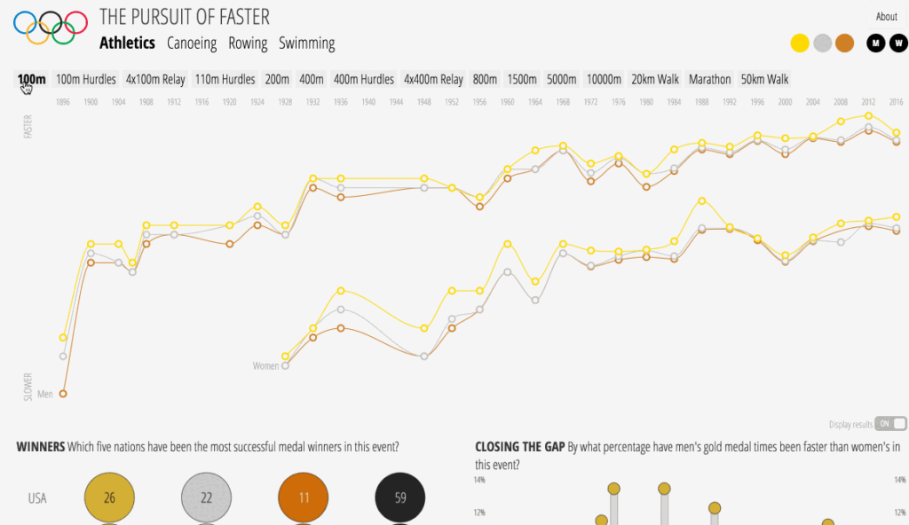
To mark the completion of the Rio 2016 Olympic Games, I have been working, with my trusted lieutenant Andrew Witherley, on designing a new version of ‘The Pursuit of Faster‘ project. This visualisation explores the evolution of medal winning performances across all Olympic Games since 1896 as athletes strive for that ultimate pursuit of being faster than the rest.
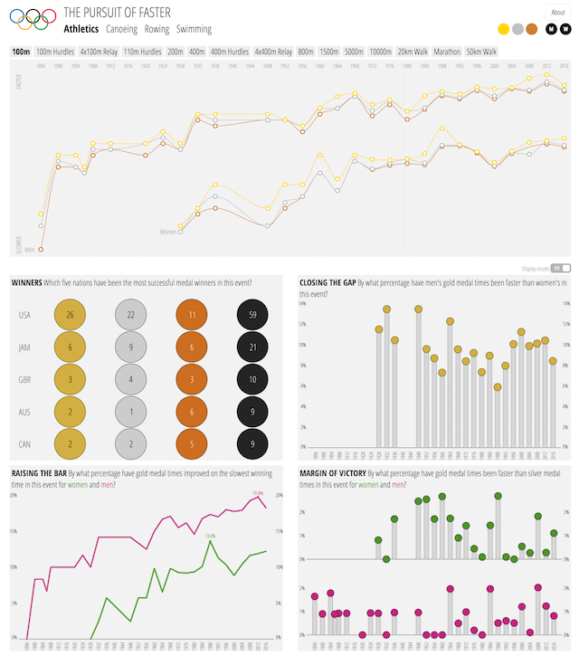
It portrays the patterns of improvements in the results of time-based events whether it be on foot, in water or on water. There are several sporting events where relative speed determines medal success but this analysis is purely concerned with results from races where absolute speed is the measure of success.
Choose a sport and select an event to see how Gold, Silver and Bronze winning times have changed over the years, for both men and women. Hover over the medal markers to reveal the actual results (you can switch on/off this semi-transparent pop-up, though, using the provided toggle). Below the main chart you can learn about the most successful countries in each event, the gaps that exist in result times between genders, a normalised measure of improvement over time, and analysis about the margins of victory between Gold and Silver medallists. To learn more about the background to the project, how to read/use it and notes on how data has been handled, you can click on the project’s ‘About’ button.
This project was originally launched in 2012 as part of a pre-London Olympics visualisation contest (securing a runners-up prize) but I wanted to employ a fresh design and incorporate all the subsequent results data from the 2012 and 2016 Games. The project now has a more adaptive design for desktop, tablet or phone. The image above shows the full-screen view on desktop, this next image shows the full-screen view of the mobile version. The only difference is that the main chart is transposed and the mouseover results are switched off in the mobile version.