
This is part of a series of posts about the ‘little of visualisation design’, respecting the small decisions that make a big difference towards the good and bad of this discipline. In each post I’m going to focus on just one small matter – a singular good or bad design choice – as demonstrated by a sample project. Each project may have many effective and ineffective aspects, but I’m just commenting on one.
The ‘little’ of this next design relates to the possibility of offering a different emphasis on presented data through a small change in a chart’s composition. The chart in question is some analysis (only source I can find is here) by Robert Mann titled ‘Who Lies More: A Comparison’ about the degree of truthfulness or otherwise (as per PolitiFact’s independent ratings) of 50+ statements made since 2007 from each of the array of presidential candidate.
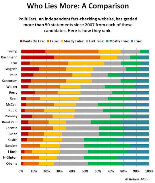
Given the focus of the analysis as a reader is largely about seeing the overall polarity of truthfulness, I would probably have pivoted the stacks either side of a centrally positioned baseline, with the ‘falser’ three categories (Pants on Fire, False, Mostly False) to the left, maintaining the connotation of being negative) and the ‘truer’ three categories (Half True, Mostly True, True) to the right. You could argue for ‘half true’ to be on either side, I would say in this era of politics it is probably true enough to be seen as a positive. This layout would still facilitate readability of the component sizes, just as as before, but it would also provide a more immediate overall view of the general balance of the integrity in these peoples’ statements.
(This is something John Nelson has written about previously, check out his article from 2011 and *update* Jon Peltier discusses how to make the proposed redesign of this chart).