This is part of a series of posts about the ‘little of visualisation design’, respecting the small decisions that make a big difference towards the good and bad of this discipline. In each post I’m going to focus on just one small matter – a singular good or bad design choice – as demonstrated by a sample project. Each project may have many effective and ineffective aspects, but I’m just commenting on one.
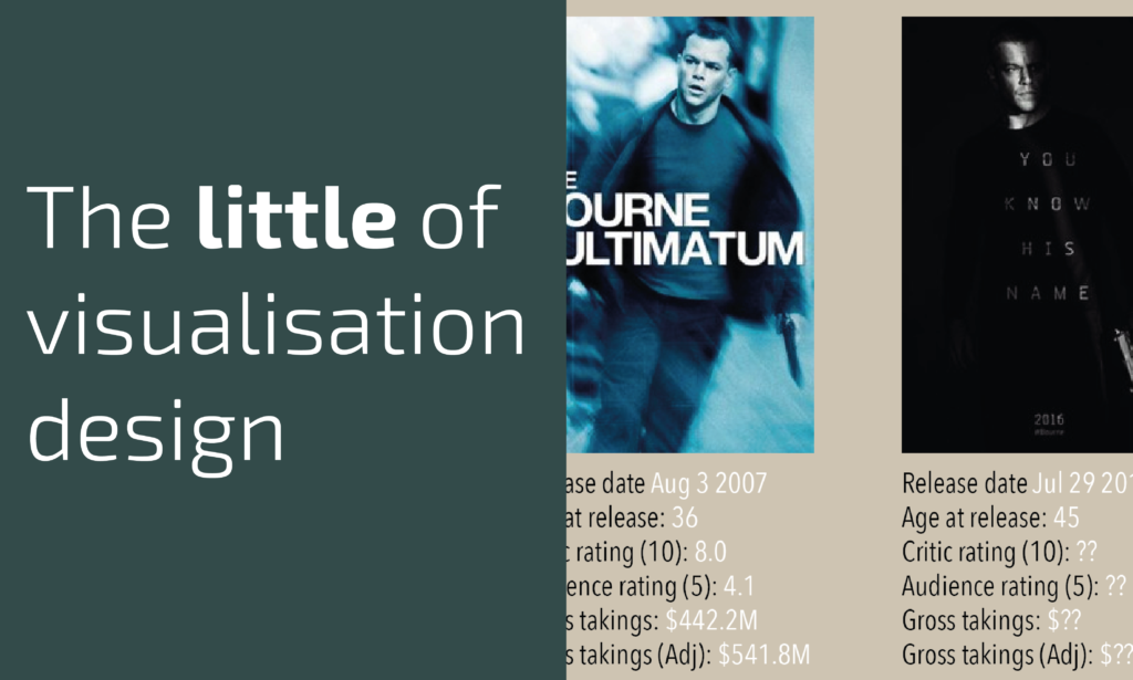
The ‘little’ of this next design involves criticism of my own work (“About time”, you say) and concerns the matter of design thoroughness. In my book, this is something I position as being part of the pursuit of elegance in your design execution. The graphic in question is one I quickly compiled and tweeted out yesterday morning, looking at analysis of Matt Damon’s roles in the the Jason Bourne movies, to mark the release of the latest movie in this series.
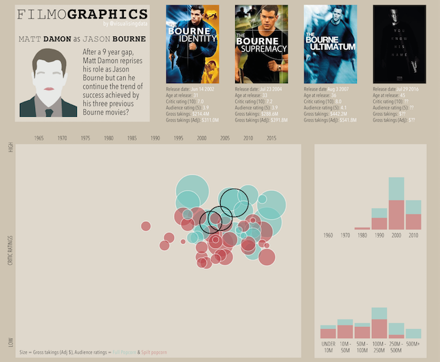
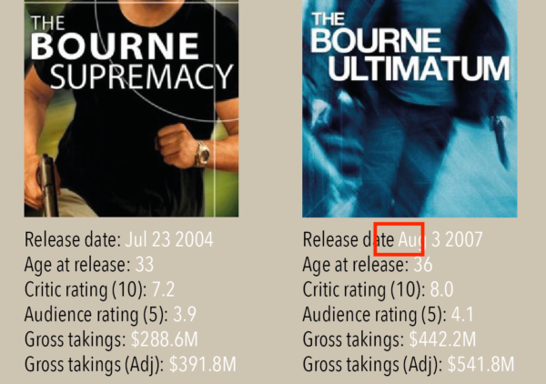
The issue I want to highlight here is the simple failure to be consistent in my use of a colon following the ‘Release date’ label in the captions below each movie poster. I missed two colons. A small matter you might think and you would be right but ever since publishing the graphic I’ve been agonising over this mistake. Remember, this is the ‘little of visualisation design’ and these type of errors (left in through a failure to thoroughly check work) demonstrate a failure to either find time or care enough to pay attention to the smallest of details. These are building blocks of quality visualisation design so care over every last detail.