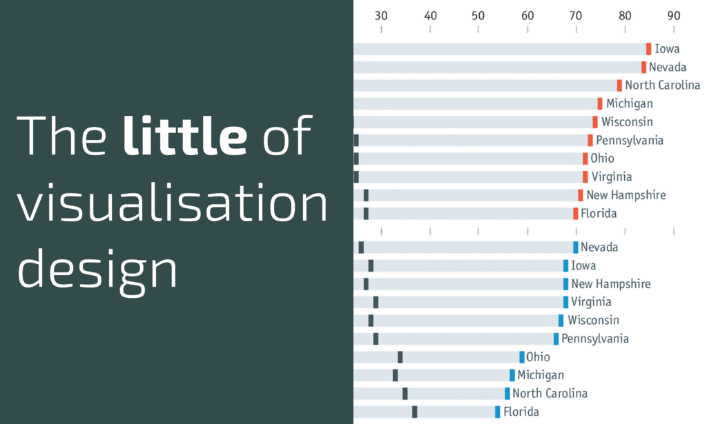
This is part of a series of posts about the ‘little of visualisation design’, respecting the small decisions that make a big difference towards the good and bad of this discipline. In each post I’m going to focus on just one small matter – a singular good or bad design choice – as demonstrated by a sample project. Each project may have many effective and ineffective aspects, but I’m just commenting on one.
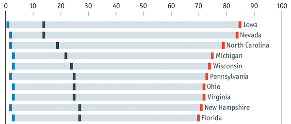
The ‘little’ of this next design concerns the sensible positioning of categorical labels. This Daily Chart, by the Economist’s data team, offers a view of the identified political persuasion of people living in selected swing states of America. The chart is a variation of the connected dot plot, with a separate row for each state.
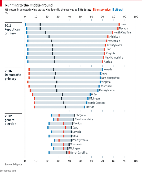
Typically, charts like this would have categorical value labels right-aligned to the left of the vertical axis. However, in this case, the labels are positioned with immediate proximity just to the right of the highest value – which is the value used to order the categories vertically. This approach aids readability, making it just that little bit more efficient to perceive the values and their associated categories.