
In order to sprinkle some star dust into the contents of my book I’ve been doing a few interviews with various professionals from data visualisation and related fields. These people span the spectrum of industries, backgrounds, roles and perspectives. I gave each interviewee a selection of questions from which to choose six to respond. This latest interview is with Valentina D’Efilippo, Information Designer. Thank you, Valentina!
Q1 | What was your entry point into the field: From what education/career background did you transition into the world of data visualisation/infographics?
A1 | After earning my Industrial Design degree in Italy, I moved to London to study Graphic Design. Then, despite graduating with a predominantly print portfolio, I found work in digital advertising. I worked as an interactive designer for various agencies over the next 4-5 years. In 2011, I set up my own company to work freelance and start focusing more on the visual display of information and data viz. Eventually I published my own infographic book: The Infographic History of the World. I think that data visualisation is the connector between the various skillsets. It’s a blend of illustration, art direction and the rigorous user focus approach of industrial and interaction design.
Q2 | What is the single best piece of advice you have been given, have heard or have formed yourself that you would be keen to pass on to someone getting started in a data visualisation/infographics-related discipline?
A2 | I personally was a bit disillusioned early in my professional career – commercial work can involve briefs with little room for artistic meaning. But luckily, I was encouraged to explore ideas that inspired me and I refocused on self-initiated projects to nurture my own ideas. I would recommend to anyone getting started in any creative field: do not let commercial routine stifle your creativity – keep experimenting, be curious and proactive.
Also, keep learning and embrace the skills you do not yet have. Especially in the world of data viz, we are required to do so many things at once – do not let your current skillset limit your exploration. Plus, the community is vibrant and open. You can work with talents who come from a variety of fields: journalism, design, coding, data science, just to mention a few.
Q3 | When you begin working on a visualisation task/project, typically, what is the first thing you do?
A3 | The first thing I do is making sure I clearly understand the brief. And, if it’s a self-initiated project, it can be even more important to outline primary objectives. For me, the most important questions are What, Why, and Who? What insight does the data provide? Why am I creating a data viz or, in other words, what is the purpose? And, lastly, who is my audience and why would they care? Once these three questions are explored, the answer to how I’m going to tell this story follows more naturally.
Q4 | At the start of a process we are often consumed by different ideas and mental concepts about what this project ‘could’ look like. How do you maintain the discipline to recognise when a concept is not fit for purpose (for the data or analysis you are ultimately pursuing)?
A4 | I love this question! I think the reconciliation happens organically when we adopt a research-based approach to evaluation and design. In my opinion, decisions on the outcome emerge from data analysis as well as research into the subject. In other words, I explore how to best display the data insights, and I parallel I consider the art direction that will be most suitable to the subject. I do not treat these two tasks independently because I believe the visual should provide clarity on the story’s topic and connect with the audience – but at the same time, it must be functional and become the vehicle to deliver and clarify the data insights. I also do not enforce a personal aesthetic preference, but I rather adopt a different style for each outcome, based on the subject represented.
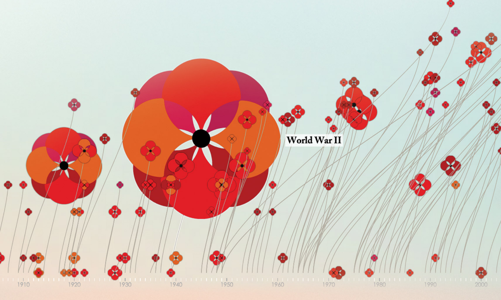
Q5 | Given the popularity and exposure of your recent ‘poppies’ project, what are some of the key lessons you have learnt yourself when you reflect on your experiences with that work?
A5 | Well, there were quite a few key lessons…
Poppy Field reinforced (I hope!) the value of finding a compelling visual approach that accurately represents the data as well as connects with the audience. But the initial outcome, which was printed in the book, was limited by space and the static nature of the medium. In exploring alternatives outcome that could deliver a more comprehensive representation, collaboration was key. I would not have been able to create a worthy interactive experience without working with my talented friend and developer, Nicolas Pigelet. Secondly, it was intimidating to release to the public a self-initiated project on such a delicate subject considering some limitation with content and data source. But I came to appreciate that “it’s ok” to offer a relevant way of looking at the subject, rather than provide beginning-to-end conclusion. And finally, I learnt to appreciate more the power of social media. I must admit that I am not very engaged with social platforms, but Twitter and Facebook were powerful communication channels for both distribution and validation.
Q6 | Aside from freely accessible metrics like hits, retweets, likes etc. what has proven to be the most valuable approach you have found to evaluate your work (post completion)?
A6 | I guess that depends on the project, as they each come with different reward. Tweets and media attention are great, but for Poppy Field I was more interested in user engagement. On average people had a lengthy interactions with the website, meaning they were interested in learning and reading the content. For my book, The Infographic History of the World, for instance, the design awards and the social media attention were certainly rewarding – especially the recognition of others in the design community. But the most gratifying moments are when readers share something about their experience with your work. The most exciting thing I heard was about the book being added to academic curriculum for an English school in Venezuela. It’s so rewarding to think that something I created is helping kids to get closer to history and think about numbers in a visual form.
Header image taken from Valentina’s ‘Poppy Field‘ project.