
In order to sprinkle some star dust into the contents of my book I’ve been doing a few interviews with various professionals from data visualisation and related fields. These people span the spectrum of industries, backgrounds, roles and perspectives. I gave each interviewee a selection of questions from which to choose six to respond. This latest interview is with Stefanie Posavec, Information Designer and soon to be a published co-author. Thank you, Stef!
Q1 | What was your entry point into the field: From what education/career background did you transition into the world of data visualisation/infographics?
A1 | I studied in university to be a graphic designer on my BA, then completed an MA in Communication Design, where I started to be drawn towards working with data. What’s interesting is that on the course I wasn’t really aware that what I was creating was data visualisation until someone described it later; my course emphasised designing information within the scope of book design or wayfinding systems, but data visualisation as practised by a designer was perhaps a pretty new concept then.
Q2 | We are all influenced by different principles, formed through our education, experience and/or exposure to others in the field – if you had to pick one guiding principle that is uppermost in your thoughts as you work on a visualisation or infographic, what would it be?
A2 | ‘Everything must have a reason’… A principle that I learned as a graphic designer that still applies to information design. In essence, everything needs to be rationalised and have a logic to why it’s in the design / visualisation, or it’s out.
Q3 | How do you mitigate the risk of drifting towards content creep (eg. trying to include more dimensions of a story or analysis than is necessary) and/or feature creep (eg. too many functions of interactivity)?
A3 | In my mind, I see a strong concept as being a single unified thread, where the data, the aesthetic, the visual metaphor, the editorial focus, and so on all work to communicate this grand overarching concept. This sounds strange, but I spend a lot of my time trying to mentally link this concept thread in a complete circle, tying the entire concept into a neat package. If something doesn’t help create this ‘neatly-packaged’ feeling in my mind, I cut it. (harder than it sounds, of course!)
Q4 | At the start of a design process we are often consumed by different ideas and mental concepts about what a project ‘could’ look like. How do you maintain the discipline to recognise when a concept is not fit for purpose (for the data, analysis or subject you are ultimately pursuing)?
A4 | I tend to keep referring back to the original brief (even if it’s a brief I’ve made myself) to keep checking that the concepts I’m creating tick all the right boxes. Or, sometimes I get excited about an idea but if I talk about it to friends and it’s hard to describe effectively then I know that the concept isn’t clear enough. Sometimes just sleeping on it is all it takes to separate the good from the bad!
Q5 | How important to you is the idea of establishing a workflow/process that you can adopt on any new task you work on? Alternatively, does your experience give you the confidence to be able approach tasks with a greater sense of freestyling, not being constrained by a sequenced approach to thinking?
A5 | Having an established workflow is important to me, as it helps me cover all the bases of a project, and feel confident that my concept has a sound logic. I wish I could freestyle more often, but unfortunately I think it goes against my nature! But having said that, spending much of my time working on a drawing project this year where you can’t ‘undo’ mistakes like you can on the computer has helped me become more free-form as I am less afraid of making mistakes, so I think this can be learned (after learning a basic process first, that is)
Q6 | Beyond the world of infographics/visualisation what other disciplines/subject areas/hobbies/interests do you feel introduce valuable new ingredients and inspire ongoing refinement of your techniques?
A6 | Recently taking up drawing has helped me better articulate the images I see in my mind, otherwise I still follow up on all different types of design and art outside information design / data visualisation. I try to look at things outside my field as often as I can to keep my mind fresh as opposed to only looking at projects from my field for inspiration.
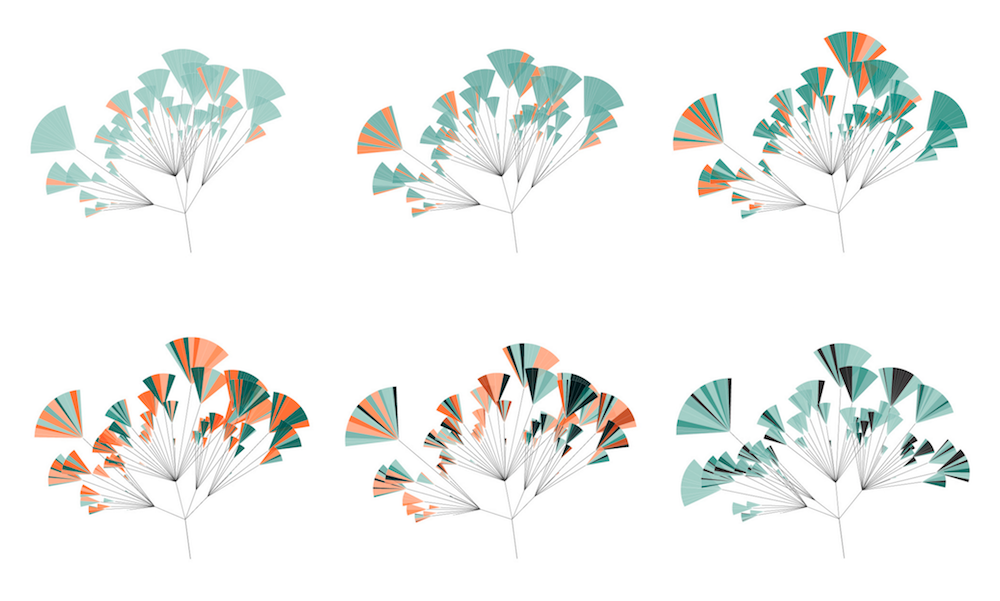
Header image taken from Stefanie’s work on the project ‘(En)tangled Word Bank‘.
