
In order to sprinkle some star dust into the contents of my book I’ve been doing a few interviews with various professionals from data visualisation and related fields. These people span the spectrum of industries, backgrounds, roles and perspectives. I gave each interviewee a selection of questions from which to choose six to respond. This latest interview is with Simon Scarr, Deputy Head of Graphics at ThomsonReuters in Singapore. Thank you, Simon!
Q1 | What was your entry point into the field: From what education/career background did you transition into the world of data visualisation/infographics?
A1 | After college I furthered my studies with a diploma in “Information graphics and newspaper design”. This led me straight into the field and straight into the newsroom. That was around 15 years ago now.
Q2 | What is the single best piece of advice you have been given, have heard or have formed yourself that you would be keen to pass on to someone getting started in a data visualisation/infographics-related discipline?
A2 | I think this is something I’ve learned from experience rather than advice that was passed on. Less can often be more. In other words, don’t get carried away and try to tell the reader everything there is to know on a subject. Know what it is that you want to show the reader and don’t stray from that. I often find myself asking others “do we need to show this?” or “is this really necessary?”. Let’s take it out.
Q3 | When you begin working on a visualisation task/project, typically, what is the first thing you do?
A3 | Read. It’s vital that you have a good understanding of your subject matter before even thinking about what a graphic will look like or focus on. The content of a graphic is the most important element.
Q4 | How do you mitigate the risk of drifting towards content creep (eg. trying to include more dimensions of a story or analysis than is necessary) and/or feature creep (eg. too many functions of interactivity)?
A4 | It’s important to manage this before it actually starts. Make sure you do all of your research before building anything. I like to map out what it is you’ll be focusing on and how you want to show it. As a project or graphic takes shape you’ll be less likely to be surprised by interesting info you find and less tempted to alter your train of thought.
Q5 | As you know there is a lot of science underpinning the use of colour in data visualisations. There is also, however, a lot that can be achieved through applying common sense. What is the most practical advice you’ve read, heard or have for relative beginners in respect of their application of colour?
A5 | If using colour to identify certain data, be careful to not accidentally applying the same identity to a nearby part of the graphic. Don’t allow colour to confuse just for the sake of aesthetics.
I also like to use colour to highlight. A single colour highlight on a palette of muted colours can be a strong way to draw attention to key information.
Q6 | We often hear how important ‘designing for an audience’ is but this is often easier said than done. How do you integrate this perspective of thinking into your own workflow? Do you have advice on any effective approach(es) you use for this?
A6 | Remember that you’re designing for the general reader (most of the time) and not people in our field. Using a very elaborate visualization technique may catch the eye of some of your peers but it’s no good if a general audience can’t understand it. When nearing a finished draft I try to show the piece to someone with no prior knowledge of the project or subject. Don’t talk them through it. Just see if they understand it and are able to pick up the key takeaways.
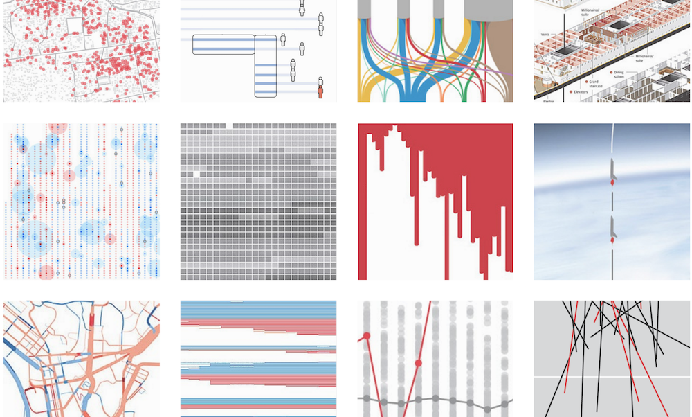
Header image taken from Simon’s portfolio page.