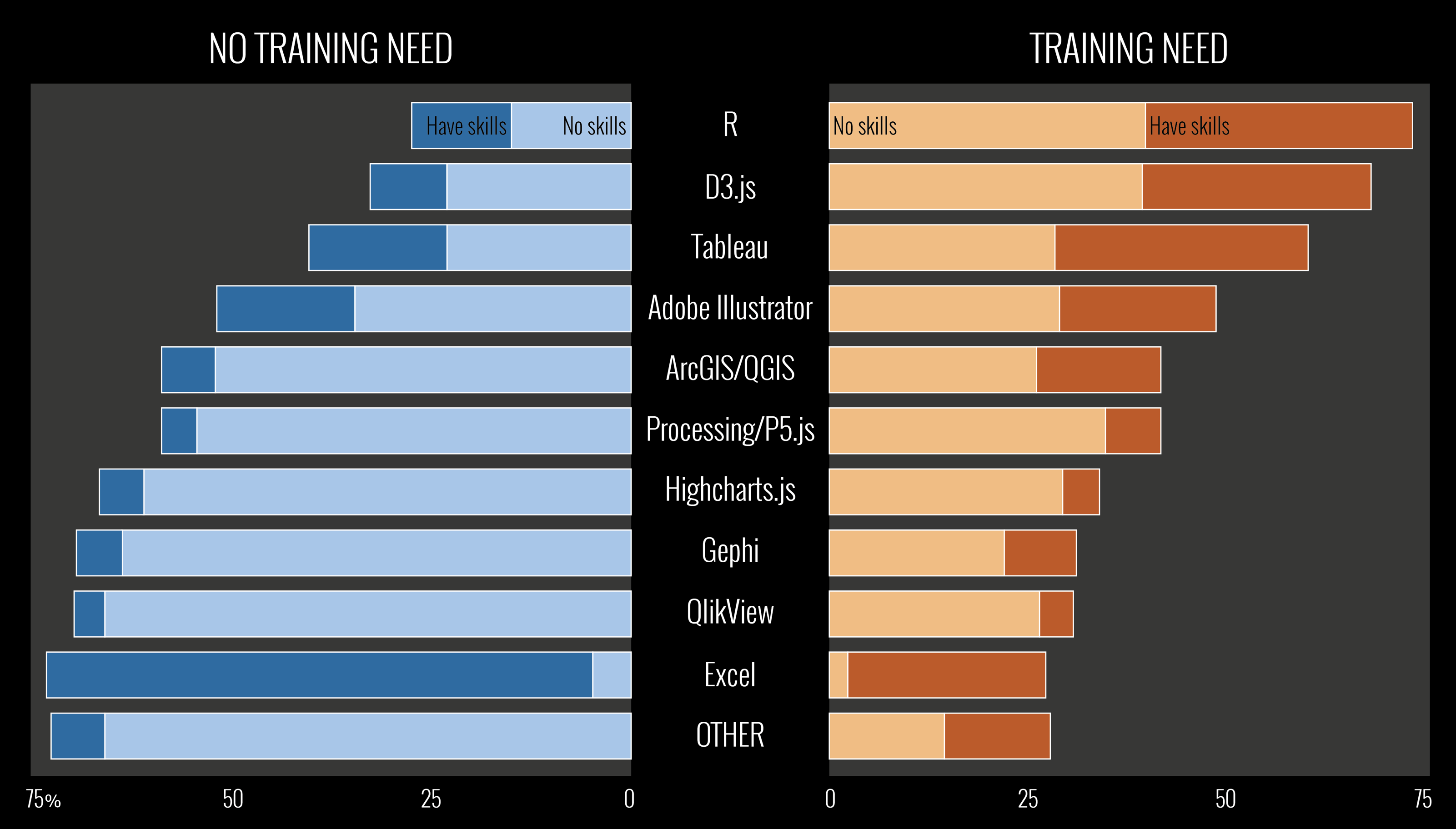
This was a short survey used to assess the appetite and needs for training in specific tools/applications/libraries for producing data visualisation work. The purpose was to quantify the challenges of training specific tools alongside the broader teaching of data visualisation. It was open for participation for 48 hours between Tuesday 7th to Thursday 9th June 2016 and 348 participants contributed responses.
This had no pretence of being an exhaustive survey – there are hundreds of tools out there – rather it was quick and simplistic attempt to take a quick pulse of the field right now based on a list of ~10 common, non-browser based visualisation tool options. The term ‘tools’ was used as a singular catch-all term for convenience.
There was a deliberately non-specific ‘other’ also included, in a way, to potentially make the point about how diverse needs are. If participants had any other existing skills or strong desire of a skill from a tool not listed, they could just use this other as the place to log that regardless of what it is. I knew geographers and GI analysts would not be happy with my lumping together of ArcGIS and QGIS but it was more the general training in either these options I wanted to capture.
Here is a summary of the results, click for a larger image: