This is part of a series of posts about the ‘little of visualisation design’, respecting the small decisions that make a big difference towards the good and bad of this discipline. In each post I’m going to focus on just one small matter – a singular good or bad design choice – as demonstrated by a sample project. Each project may have many effective and ineffective aspects, but I’m just commenting on one.
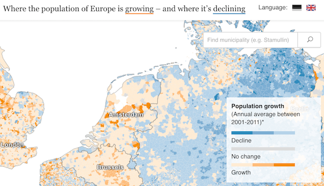
The ‘little’ of this next design concerns a similar theme to two previous LittleVis posts (#10, #14) about squeezing more potential from annotated features. In this case it is about a clever little design choice incorporated into a project’s title: the project being ‘Where the population of Europe is growing – and where it’s declining‘ by the team at Berliner Morgenpost.
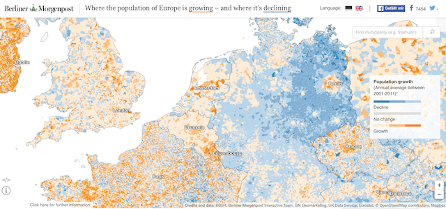
As you see in the title, the colour associations are immediately explained through the underlining strokes, indicating the areas where the population is growing (orange) and declining (blue). There is a more detailed colour key provided as well, but given the title is amongst the first places our eyes are directed towards this immediate colour attribute explanation offers a nice ‘quick start’ route into the project below.