
In order to sprinkle some star dust into the contents of my book I’ve been doing a few interviews with various professionals from data visualisation and related fields. These people span the spectrum of industries, backgrounds, roles and perspectives. I gave each interviewee a selection of questions from which to choose six to respond. This latest interview is with Jen Christiansen, graphics editor at Scientific American. Thank you, Jen!
Q1 | What was your entry point into the field: From what education/career background did you transition into the world of data visualisation/infographics?
A1 | I came at the field from an illustrative background. I’ve been practicing art ever since I can remember. Formal training started in high school, when I took classes and worked in a painting and illustration studio, cleaning palettes while watching the pros that leased studio space. But I was also a science-fair and science-olympiad kid. In college I managed to keep a foot in both worlds, and completed a double major in geology and studio art. But what about the next step? Was I a scientist or an artist?
I loved the clarity and order inherent to the scientific process; ask questions, set up methodologies, collect data, analyze. No matter the result of the study–don’t even ask about the punch line of my college honors thesis–it gave me the chance to contribute a rigorously-produced bit of knowledge. But I also loved the idea of communicating through visuals rather than words. My studio arts classes encouraged me to question and morph methodologies. I couldn’t stop making images. Nor could I imagine choosing one discipline at the expense of the other. Scientific illustration, however, would allow me to merge those two identities. I was thrilled to find the perfect graduate program for me at the time: Science Communication/Natural Science Illustration at the University of California, Santa Cruz (the program is now located at CSU, Monterey Bay).
I eventually shifted from illustrating objects (like newly described species) towards art directing process and concept diagrams for magazines and textbooks. Instead of contributing new scientific findings to the world, I found a niche helping to make sure that other peoples’ findings were accessible to wider audiences through a visual language. Science research is heavily rooted in data collection and analysis, so data visualization was always a part of the tool box.
Q2 | With deadlines looming, as you head towards the end of a task/project, how do you determine when something is ‘complete’? What judgment do you make to decide to stop making changes?
A2 | Magazine work revolves around hard-deadlines, and we’re dealing with overlapping monthly issue production schedules, so it’s critical to keep things rolling forward efficiently. In order to keep the article team focused on really reviewing sketches carefully, I try to keep change requests limited to 3 rounds: in response to (1) concept sketch(es), (2) tight sketch, and (3) final. The concept sketch phase is the time for experimentation and creativity. At this point, I’m looking for overall setup of the information and narrative flow…the skeleton of the graphic. As soon as that basic plan is established, things really need to dial in. The tight sketch makes content-related adjustments to that skeleton, and critical content details are clarified. A suggestion of ultimate look of things starts to emerge (color palette and style). As far as the final round goes, my utmost concern is with accuracy and legibility. I take aesthetics very seriously, but I’ll generally pull an all-nighter before a press-date only in the event of correcting issues related to accuracy and legibility.
Q3 | We are all influenced by different principles, formed through our education, experience and/or exposure to others in the field – if you had to pick one guiding principle that is uppermost in your thoughts as you work on a visualisation or infographic, what would it be?
A3 | For me, it’s largely about serving the content, and developing a visualization that makes the main points clear. Since I’m most often dealing with graphics that communicate specific research findings (as opposed to visualizing data in the process of analyzing it), there’s generally a pre-existing — and peer-reviewed — punchline. For those graphics, I keep referring to the conclusion as my guiding principle. Does the graphic help make the punchline of the story clear? How can visuals provide the background/context to understand that punchline more efficiently — and completely — than words? The graphic needs to be engaging, for sure (see response #3, below). But hopefully that can develop alongside efforts to clearly communicate the core scientific concept.
Occasionally I work in items that are more fun and exploratory in nature. If the point of the graphic is to simply get folks interested in a scientific topic, and encourage them to spend some exploring a data set or concept…. then I’m more focused on working with freelancers to create an engaging and dynamic visual. In that case, I’ll loosen up a bit, and err on the side of design choices made for purely aesthetic reasons.
Q4 | As Art Director one of your roles will be commissioning and coordinating others to contribute designs to the magazine. As you operate at the junction between designers/developers and domain experts, what would you describe as being the most important attributes of managing people/projects that help make the experience as effective and efficient as possible?
A4 | To keep things moving efficiently, and to manage everyone’s expectations fairly, I try to be as clear as possible in the initial project brief. If there’s a very specific end-point in mind, and most of the background research has already been completed, the freelance designer/illustrator’s role is very different than for a more open-ended project, when I’d like them to explore several possibilities and provide recommendations. By articulating the scope of the project, outlining a clear deadline schedule (and indicating when/if there’s any flexibility with that schedule), and providing the reference material that I already have assembled, I try to set up the freelancer to make an informed decision on whether or not they can — or want to — accept the job. And it helps to make the expectations clear. Sometimes I’m looking for an artist that can breathe life into an already decided-upon solution. In other cases, I’m looking for someone to develop a plan with very little initial direction. The distinction between those two approaches is pretty important, and it behooves everyone to understand the expectations as early as possible.
Q5 | You will also play a key role in evaluating work that you commission. What are some of the key components of assessment you are making when determining if a design is at the right level to be published?
A5 | When it comes to data visualizations, I’m obsessed with alignments. Sloppy label placement on final files causes my confidence in the designer to flag. What other details haven’t been given full attention? Has the data been handled sloppily as well? Not to mention, I then have to then spend more time cleaning up the files and preparing them for press, during the busiest time of the deadline cycle — as the full issue is barreling towards transmittal to the printer. On the flip side, clean, layered and logically built final files are a thing of beauty….and my confidence in the designer, and their attention to detail, soars.
Q6 | During your appearance on the recent data stories podcast episode, you discussed a project that used illustrations (Moritz’s bee project) almost as a visual hook to draw people in. Can you just elaborate a little more on the thinking behind that and what role you feel illustrations/photo-imagery have to play alongside visualisation assets?
A6 | I love the idea of Edward Tufte’s assertion that “Graphical excellence is that which gives to the viewer the greatest number of ideas in the shortest time with the least ink in the smallest space.” But I found that when I developed magazine graphics according to that philosophy, they were most often met with a yawn. The reality is that Scientific American isn’t required reading. We need to engage readers, as well as inform them. I try to do that in an elegant, and refined, and smart manner. To that end, I avoid illustrative details that distort the core concept. But I’m happy to include them if the topic could benefit from a welcoming gesture. As I presented at the Communicating Complexity conference in 2013,
“Before you can even begin to communicate a complex topic, you must first engage an audience. Whereas minimalist and abstract iconography may be the most efficient and elegant way to communicate complex findings within a research community (arguably a captive audience), I suggest that this design approach can actually be off-putting to a non-specialist audience. If an information graphic does not incorporate immediately-visible context, a familiar visual vocabulary, or a welcoming gesture for the non-specialist reader, it may simply confirm a preconception that the content itself is abstract and unrelatable — thereby shutting down the opportunity to convey that information to a new audience… I argue that although it’s possible that superfluous texture, detail, and color may distract a bit of attention from communicating the core concept, the trade-off can be worth it. Beautifully detailed and somewhat fancifully figurative art can engage and inspire a reader. This is particularly true, for example, when trying make counterintuitive and complex concepts in cosmology and quantum physics accessible to a science savvy, but non-specialist audience.”
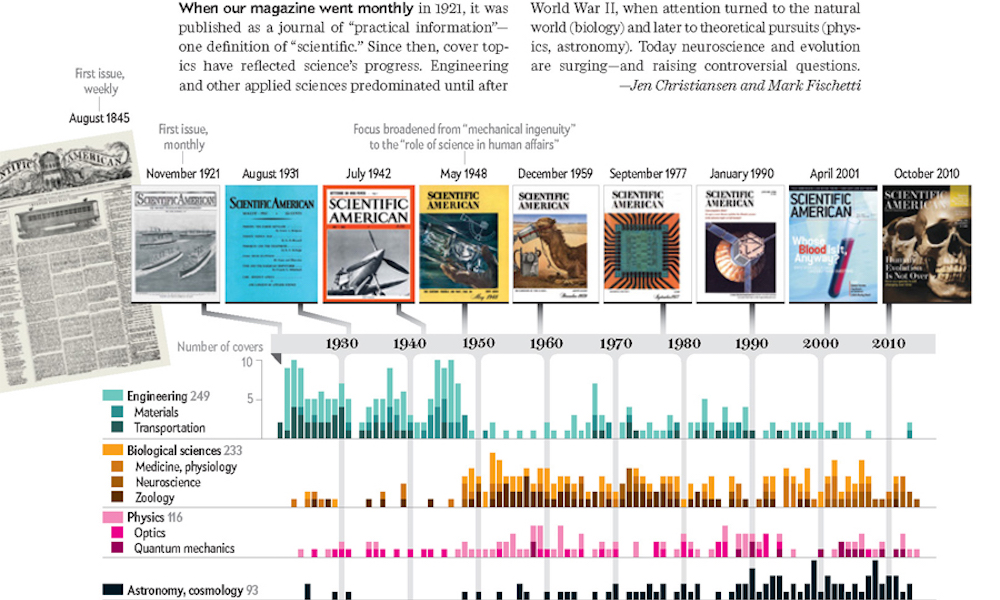
Header image taken ‘How Science Evolves’.