
In order to sprinkle some star dust into the contents of my book I’ve been doing a few interviews with various professionals from data visualisation and related fields. These people span the spectrum of industries, backgrounds, roles and perspectives. I gave each interviewee a selection of questions from which to choose six to respond. This latest interview is with Alan Smith OBE, Data Visualisation Editor at the Financial Times. Thank you, Alan!
Q1 | What was your entry point into the field: From what education/career background did you transition into the world of data visualisation/infographics?
A1 | My entry point was cartography/Geographic Information Systems (GIS) – but in a very specific way. My thesis for my Masters in GIS, back in 2003, was essentially ‘do you need GIS anymore to put maps on the internet?’ – it was a long look at Scalable Vector Graphics (HTML/SVG, the underlying technology exploited by d3). Even that far back, it was clear that web technology was going to encourage content convergence – maps, charts, images, text, all in one single format . Basically, the toolbox was being opened right up. I think visualisation as a discipline has benefitted massively from that. Now, we’re starting to see visualisation appear in academic curricula, across a variety of disciplines, which can only be a good thing.
Q2 | We are all influenced by different principles, formed through our education, experience and/or exposure to others in the field – if you had to pick one guiding principle that is uppermost in your thoughts as you work on a visualisation or infographic, what would it be?
A2 | Given my background at the Office for National Statistics, I would have to say the statistical principles! Are you picking out and emphasising key statistical relationships in your data in a way that will make sense to users? That doesn’t mean everything has to be a bar chart – but it can be a very strong way of managing the audition process when it comes to choosing the right symbology.
Q3 | If you had the time and resources (perhaps more skills, new tools) to revisit one project from your past and make improvements to certain features, which project would it be and what would you change?
A3 | That’s difficult – because there is not one project I have been involved in that I would execute exactly the same way second time around. So I could conceivably pick any of them – and probably the thing they could all benefit most from? More inter-disciplinary expertise…
Q4 | We often hear how important ‘designing for an audience’ is but this is often easier said than done. How do you integrate this perspective of thinking into your own workflow? Do you have advice on any effective approach(es) you use for this?
A4 | Develop personas to represent your users and their needs – this helps you to move away from thinking only ‘what can they understand?’, but also ‘what do they need?’
Q5 | As you will fully appreciate, the process of gathering, familiarising with, and preparing data in any visualisation/infographic design task is often a sizeable but somewhat hidden burden – a task that can occupy so much time and effort but is perhaps ultimately invisible to the ultimate viewer. Obviously, pressures during this stage can come in the shape of limited timescales, data that doesn’t quite reveal what you expected and/or substantial data that offers almost too many possibilities. Have you got any stand out pieces of practical advice to share about your practices at this stage?
A5 | Don’t under-estimate the importance of domain expertise. At ONS, I was lucky in that I was very often working with the people who created the data – obviously, not everyone will have that luxury. But most credible data producers will now produce something to accompany the data they publish and help users interpret it – make sure you read it, as it will often include key findings as well as notes on reliability and limitations of the data.
Q6 | You will also play a key role in evaluating work that your team creates. What are some of the key components of assessment you are making when determining if a design is at the right level to be published/launch?
A6 | Check off each design against your own maintained content standards…(so make some – and continually improve them!)
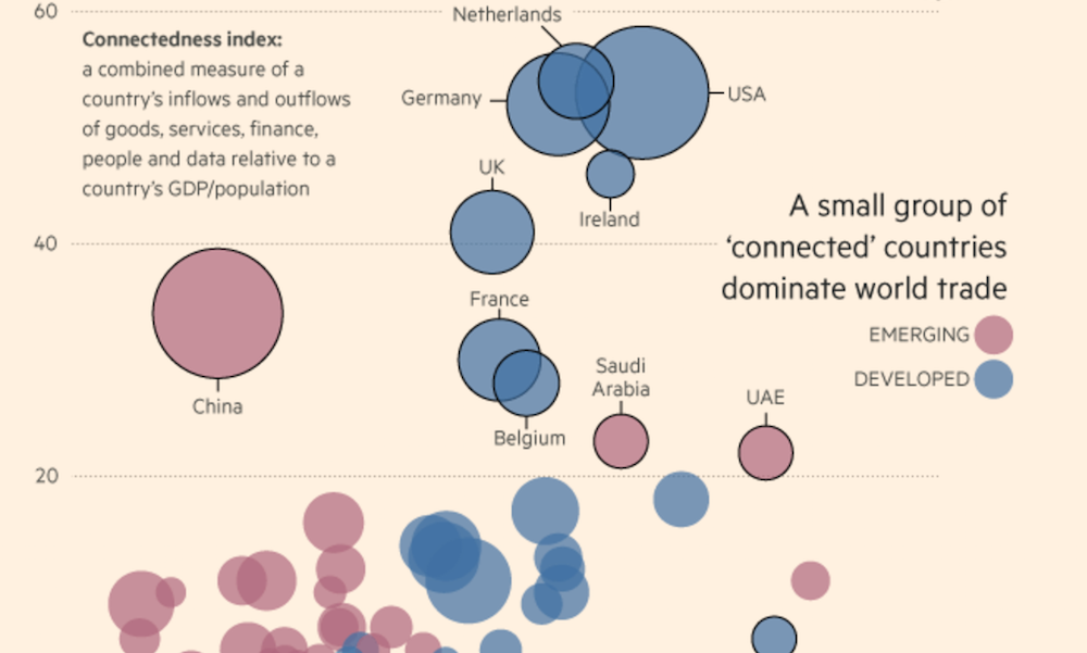
Header image taken the FT article ‘Global trade: structural shifts’.