This is part of a series of posts about the ‘little of visualisation design’, respecting the small decisions that make a big difference towards the good and bad of this discipline. In each post I’m going to focus on just one small matter – a singular good or bad design choice – as demonstrated by a sample project. Each project may have many effective and ineffective aspects, but I’m just commenting on one.
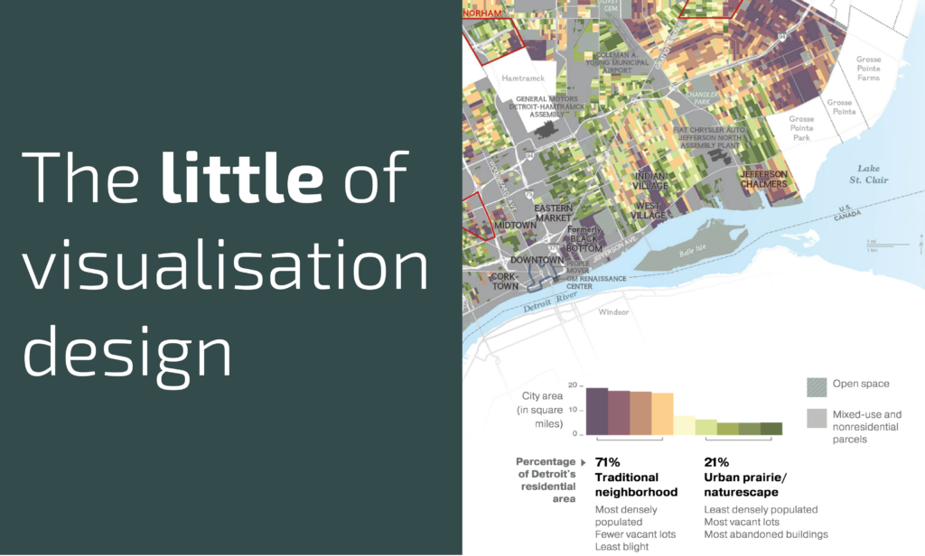
The ‘little’ of this next design concerns a clever approach to squeezing more potential out of your colour keys, as demonstrated by the project ‘Rethinking Detroit‘ by the National Geographic, looking at the changing fortunes of Detroit’s neighborhoods block-by-block.
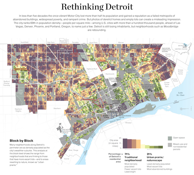
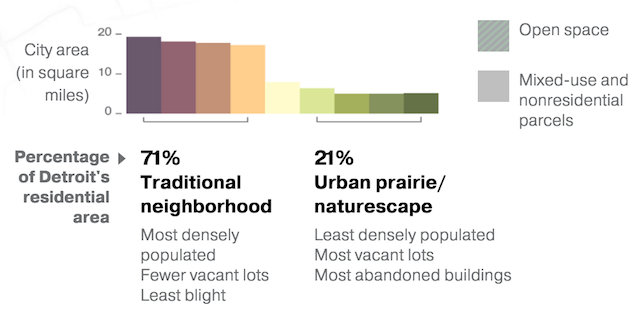
The colour key shows the degree to which a block of properties has been largely vacated/abandoned (the so-called “Urban prairie” in green) or has preserved its status as a traditional residential area (in brown). Rather than just show a colour scale, the key doubles up as a bar-chart, showing the proportion of the city’s area, in square miles, of each banding.