
In order to sprinkle some star dust into the contents of my book I’ve been doing a few interviews with various professionals from data visualisation and related fields. These people span the spectrum of industries, backgrounds, roles and perspectives. I gave each interviewee a selection of questions from which to choose six to respond. This latest interview is with Jane Pong, formerly of the South China Morning Post and Reuters and currently freelancing. Thank you, Jane!
Q1 | What was your entry point into the field: From what education/career background did you transition into the world of data visualisation/infographics?
A1 | I started with bachelor degrees in the somewhat strange (unique) combination of chemistry, psychology and linguistics. Data visualisation turned out to be the perfect blend of science and arts that I didn’t know I was looking for.
Q2 | We are all influenced by different principles, formed through our education, experience and/or exposure to others in the field – if you had to pick one guiding principle that is uppermost in your thoughts as you work on a visualisation or infographic, what would it be?
A2 | The work is not about me (the designer), it’s about everyone else (the audience), and it’s about establishing a connection. The connection could be aesthetic, an appreciation in form; or semantic, making people understand and care about the chosen topic. Some might argue that understanding comes first and foremost, but I believe creating a thing people find pleasing without understanding it straight away has its power too. It comes as no surprise that it all depends on context.
Though I must admit that I’m not always good at following that myself – there are times when I fall into the trap of designing a certain way just because I like it. It’s a tough one!
Q3 | At the start of a design process we are often consumed by different ideas and mental concepts about what a project ‘could’ look like. How do you maintain the discipline to recognise when a concept is not fit for purpose (for the data, analysis or subject you are ultimately pursuing)?
A3 | It is easy to immerse yourself in a certain idea, but I think it is important to step back regularly and recognise that other people have different ways of interpreting things. I am very fortunate to work with people whom I greatly admire and who also see things from a different perspective. Their feedback is invaluable in the process.
Sometimes I find it helpful as well to conduct mini thought experiments and work out how someone who is diametrically opposed to me in terms of background might interpret a visualisation. Would a concept still work for someone who embodies completely different knowledge, assumptions and expectations? Instead of rushing to settle on a single concept and start to develop it right away, it’s worth it to take a pause, and spend some time to really think through how the concept might or might not work in different contexts.
Q4 | If you could somehow secure 3 months to do anything you wanted, what would you love to be able to spend your time doing to enhance your data visualisation capabilities further? (Eg. Reading, making, learning new tools etc.)
A4 | Reading, definitely. But not just the obvious non-fiction books, I’d love to read a lot more fiction as well to stretch my brain a bit. I feel like reading fiction allows me to find fresh perspectives on all manner of things and build empathy, which would help me as a designer in the long run (besides, reading fiction is fun!).
I’d also like to try making things that are away from the computer screen. I’ve had an Arduino starter kit sitting on my desk for months now. Another fun thing to do would be to learn geometry through drawing.
And of course, I have a list of personal projects just waiting for me to delve into! Nothing pushes you to learn more than working on something you care about a lot. I would love to build some fun interactive visualisations and in the process level up my analytic and programming skills.
Q5 | As you will fully appreciate, the process of gathering, familiarising with, and preparing data in any visualisation/infographic design task is often a sizeable but somewhat hidden burden – a task that can occupy so much time and effort but is perhaps ultimately invisible to the ultimate viewer. Obviously, pressures during this stage can come in the shape of limited timescales, data that doesn’t quite reveal what you expected and/or substantial data that offers almost too many possibilities. Have you got any stand out pieces of practical advice to share about your practices at this stage?
A5 | Expect failure. Working with data is rarely a smooth process, it often involves twists and turns and tonnes of frustration. Don’t be discouraged – keep asking questions about the data and it may surprise you. There have been times when I had to pare down the visualisation, or even discard it altogether, but it happens. (To everyone. All the time. We just don’t hear about these failures.) The quality of visualisations is proportional to the integrity of the data.
Q6 | From your experience of publishing for print, what are some of the key tips you would offer to people creating visualisation work designed for print output?
A6 | I love, love, love print. I feel there is something so special about having the texture and weight of paper be the canvas of the visualisation. It’s a privilege to be able to design for print these days, so take advantage of the strengths that paper offers – mainly, resolution and texture. Print has a lot more real estate than screen, allowing for very dense, information packed visualisations. I love to take this opportunity to build in multiple story strands, and let the reader explore on their own. Print can be interactive too (sort of). The texture of paper can also play a role in enhancing the visualisation; consider how a design and colour choices might be different on a glossy magazine page versus the rougher surface of a newspaper.
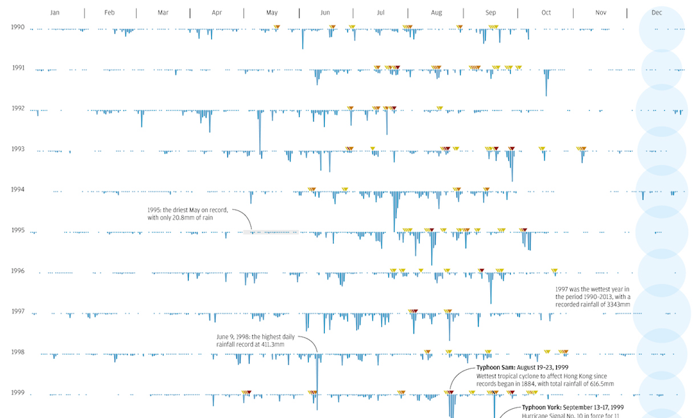
Header image taken from Jane’s work for SCMP titled ‘Rain Patterns’.
