
This is part of a series of posts about the ‘little of visualisation design’, respecting the small decisions that make a big difference towards the good and bad of this discipline. In each post I’m going to focus on just one small matter – a singular good or bad design choice – as demonstrated by a sample project. Each project may have many effective and ineffective aspects, but I’m just commenting on one.
The ‘little’ of this next design concerns the use of colour and specifically the restrictions caused by the universal application of ‘corporate’ colour palettes. There are benefits from applying consistent colours to facilitate brand recognition but sometimes this can cause unnecessary obstruction.
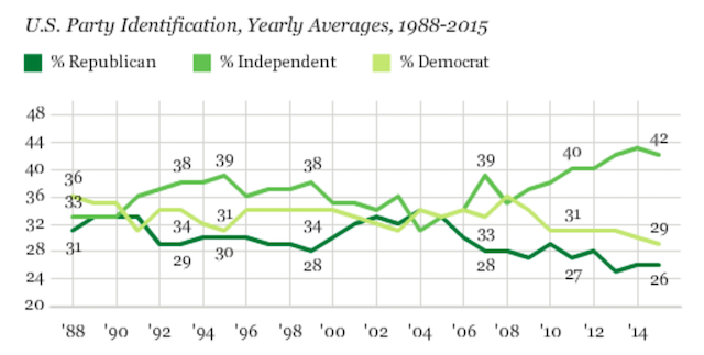
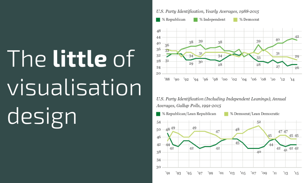
In the Gallup chart above, showing trends for how people identify with the US political parties, it would seem to be more logical to use the established associations of Republican = red, Democrat = blue and Independents = grey.
Whilst I appreciate it only requires the reader to learn 3 new colour associations, by not utilising the classic colour associations it does undermine the ‘available immediacy’ that this chart should have been able to offer.
