

This is the third in a series of three blogposts about the Seeing Data project. The first post was written by Professor Helen Kennedy, director of Seeing Data, and discussed some of the findings and what they meant for how we think about ‘effective’ visualisations. The second post reflected on one of the research methods that we used, called ‘Talking Mats’, and its potential as a means for measuring the effectiveness of data visualisations. This is the third in a series of three blogposts about the Seeing Data project. In this final part I will be reflecting on our findings and considering some implications for visualisation designers. This summarises some of the ideas I discussed in a talk I gave during a Tableau webinar in September.
Part 3: What are the implications of this study for visualisation practitioners?
In part one, Helen outlined some of the socio-cultural factors that, through our study, we found had an affect on the engagement of readers. The term ‘engagement’ in this context was deliberately broad to cover all components of a reader (which is the term I’ll stick with for consistency) experiencing a data visualisation: from the seduction or motivation to simply look at it, through using and reading the visualisation and on to the understanding that forms as a consequence of the experience.
This post builds on the framework of factors discussed in part one presenting a set of practical implications we feel are of relevance to those involved in creating data visualisations – whether as full-time professionals or part-time enthusiasts – based on the findings to have emerged from this study. That last point is important because I could speculate on many other aspects about this subject but this discussion must be rooted in what has actually been observed.
I’m sure many of the suggestions presented are quite familiar to experienced designers and developers, in which case hopefully this reinforces what you always suspected. For others, this will hopefully provide a useful framework of prompts to substantiate your appreciation about the influence these human factors might have within and across your potential audiences.
SUBJECT MATTER
This concerns the role of the subject matter and the relevance/interest this has amongst your target audience and/or recipients. ‘Design for your audience’ is always a common piece of advice but it is actually a much harder and elusive consideration in practice: it is far easier said than done but often only said and not done.
SUBJECT KNOWLEDGE: What will your intended recipients likely know and not know about this subject? What pre-requisite knowledge can be reasonably assumed? What content will need to be explained (terminology, acronyms, translation of key findings)?
TOPIC INTEREST: Will the readers likely be already interested in this topic or will they need some degree of persuasion/seduction? Marketing is a dirty word for some in this field but in certain situations there has to be an element of design thinking concerned with creating appeal towards engaging with a visualisation that might not already exist amongst cohorts of an audience.
CURIOSITIES, WANTS AND NEEDS: What do they need to know and not need to know? What curiosities are likely to be most necessary to satisfy? What are the angles of analysis you think might be most relevant to them?
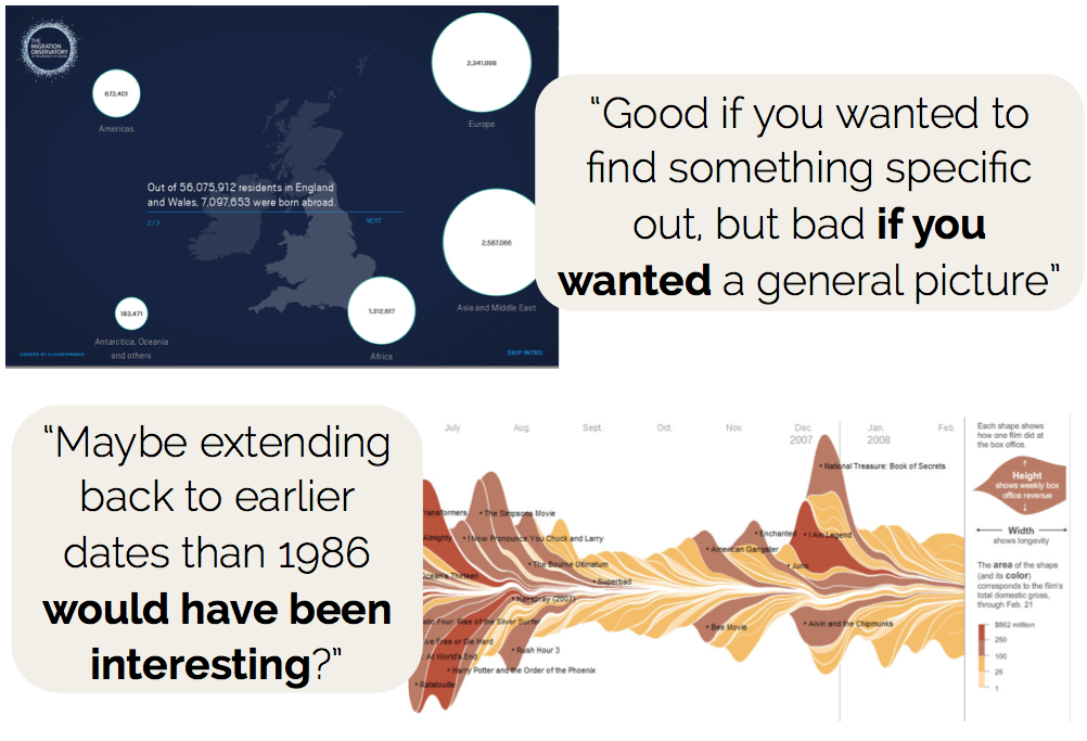
FOCUS: You can’t satisfy the needs of everyone. How much is enough and how much is too much: where is the line at which you can determine that a sufficient range of content has been offered to cover the needs of enough people? Even in apparently simple and diminutive datasets there will always be multiple permutations of different angles of analysis, different filters and data treatments that you must determine NOT to include.
TRUST
This concerns the influence of the source/location of the published visualisation work and the potential beliefs and opinions held by the readers.
BE CLEAR: Tell people what you’ve done: where has the data come from, what have you done to treat it, what assumptions you have made, what counting rules apply, what has been excluded etc. Also, manage expectations about what does the visualisation offers and also what it does not.
BE REALISTIC: Some topics are automatically going to be invoke strong passions and entrenched opinions. You can’t convince everyone, indeed you might not need to or wish to, so be realistic about your ambitions.
QUALITY: Should go without saying but worth reinforcing: there is paramount importance in the accuracy and perceived integrity of your work. Some people inherently trust data visualisations – often when they should not necessarily do so – other people are immediately suspicious of data visualisations – often when they should not necessarily need be. You can’t compensate for all human traits but you can control the quality of your work so don’t cut corners, don’t forget to check your work, don’t be complacent.
ABIDE BY THE DESIGN PRINCIPLES: Don’t abuse visual attributes such as including unnecessary 3D decoration, distorting axis truncation, flaws in your geometric calculations, obstructive and ineffective interaction features.

TIME
This concerns the characteristics of the situation or setting in which the reader will be consuming the visualisation, specifically how the design aligns with the demands of time and pressure being faced in that moment of engagement by the reader.
IMMEDIACY: The setting of how a visualisation will be consumed is a significant factor in determining the effectiveness of the design you create. Serve the setting as well as the audience. Some situations will require immediate, at-a-glance insights in less than 10 seconds, others will be compatible with a more prolonged and multi-faceted engagement.
CONSUMPTION EXPERIENCE: Some situations will require a visualisation that offers explanatory assistance to bring to the surface the key insights you think the audience need directing towards, others will fit better with an exploratory experience allowing them to make discover themselves. Sometimes you might need a blend of the two, creating a journey to offer both experiences.
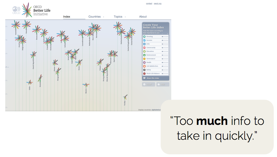
SHOW COURAGE AND CONVICTION: Echoing the point raised above against ‘focus’, don’t overwhelm your audience with too much. A deluge of content and a plethora of functionality can create paralysis: “Too much to take in, lost interest” (also known by the cool kids as “TL;DR”). Again, if the setting requires more immediacy, deliver it. Have the conviction and discipline to leave things out.
CONFIDENCE/SKILL
This concerns the variety of capabilities needed to be an effective reader of a visualisation and what you can do to appreciate and accommodate any deficit amongst your audience.
WHAT SKILLS?: There are many ingredients in the recipe of data visualisation literacy: numeracy, graphical literacy, visual literacy, computer skills, language skills, critical thinking. Beyond the specific knowledge/confidence with the subject matter you a portraying, as you consider profiling the traits of your intended recipients, consider what levels across these categories your work requires and what levels your audience will likely be comfortable with?
OFFER THE RIGHT LEVEL OF HELP: Beware the curse of knowledge – don’t assume! More than just including scales and legends – provide clear introductions, useful guides for how to use interactive functions and how to read the charts presented. Offer as much assistance as the least capable/confident member of your audience might need.
DON’T BE UNNECESSARILY SELF-RESTRICTED: Don’t avoid using a seemingly uncommon or complex chart type if it is the best way to show your data – respect people’s capacity to learn but make sure you provide the necessary help. Explain where the big and the small is, point out what is good and bad or where is expected or unexpected. There is evidence that when people get over the hurdles of an unfamiliar form, insights can be unlocked that might have appeared inaccessible at the outset.

EMOTION
This concerns the elusive influence that emotion plays in the engagement or otherwise of a reader with a visualisation, as well as the inherent qualities of a subject, its data and how it is presented
PLEASURE: Fun can be an important attribute of appeal. So long as it is not gratuitous, impeding the process of understanding, or incongruent with the subject matter, the appeal of certain colours, forms and functionality might help attract to and sustain readers with your work.
SUITABILITY: Respect the subject matter’s emotive quality, sometimes you may wish to exploit (in the best possible way) a subject’s inherent emotive characteristics, on other occasions you will seek to avoid it.
BASIC PRESENTATION CHOICES: It was noticeable the number of comments raised about basic lack of readability of text (through type and font properties typically being too small). This is an especially challenging task for designers faced with creating work that has to be potentially compatible across print, large screen and small screen but should be a fundamental concern about accessibility. Colours too are generally the first design properties noticed so use this powerful visual cue sensitively and astutely.

The closing comment is quite simple: YOU CAN’T PLEASE EVERYONE! People are unique and bring many personal and emotional characteristics that will influence engagement without any rational anticipation. We are not always in the right frame of mind, in a bad mood or just bored. Today we like purple, yesterday we preferred blue. One day we can be “oh cool, some analysis about the US elections”, the next “oh not another piece of analysis about the US Elections”. Perfection is impossible, 100% of engagement is impossible. While ever humans are involved, visualisation has to be and can only be a pursuit towards optimisation.
