
In order to sprinkle some star dust into the contents of my book I’ve been doing a few interviews with various professionals from data visualisation and related fields. These people span the spectrum of industries, backgrounds, roles and perspectives. I gave each interviewee a selection of questions from which to choose six to respond. This latest interview is with Giorgia Lupi, co-founder of and Design Director at Accurat. Thank you, Giorgia!
Q1 | What was your entry point into the field: From what education/career background did you transition into the world of data visualisation/infographics?
A1 | I studied architecture at the university, but I have never built or designed any houses.
During my M.Arch studies I’ve always been more interested in aspects concerning the representation of information, and I tried to push all my architectural and urban projects towards working with information and mapping systems; even my M.Arch thesis (in 2006) was an urban mapping project.
For the following 4 years I’ve been collaborating with different interaction design firms in Italy, focusing my contributions on visual documentation and representation, mapping, and information architecture.
It wasn’t until lately that I started working specifically with data visualization. It came natural to me to progressively focus more on the quantitative side within the information design field, and when I got to understand the true potential of working visually with structured data to convey information about phenomena or contexts, I simply felt in love with this world and the realm of possibility it opens. Then, in 2011 I both co-founded my on information design company (Accurat), and started a PhD in communication design at DensityDesign Lab at Milan Politecnico.
As for the job that I am doing today: at Accurat we rely on building multidisciplinary teams to work on our projects. Our team is made of designers, developers, data analysts, interaction designers, and also interestingly one of my partners, Simone, is a sociologist. I am coordinating the design teams for the representation part.
I believe my background in architecture has influenced my production considerably. The very fact that I spent almost 5 years of my life designing, “composing” and manually drawing architectural and urban plans shaped my mind and my visual aesthetics a lot. Moreover, I have played the piano for a long time, and I’ve been always very fascinated by the “repetitive” aesthetic of musical scores and intrigued by the contemporary music notation style; I believe this fascination of mine is reflected in my work as well.
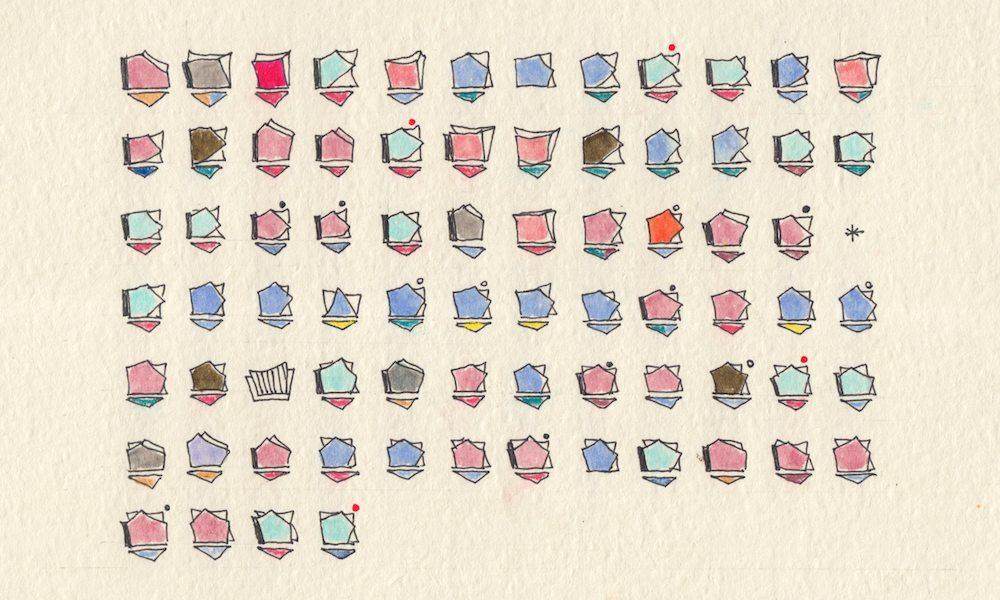
Lastly, as a human being, I have a very visual mind, and I need to draw and sketch to understand my surroundings. In fact, I’m not usually able to perfectly get and define what I’m thinking, or what pops up in my mind about a design problem, I usually say that I cannot think about a project without a pen and some paper. I know drawing is my way to understand I had an idea in the first place.
Besides, I take an incredible pleasure in drawing, in tracing lines on paper and seeing abstract shapes come alive and I’ve came to realize this practice gives shape to my inner thoughts, and influenced my visual design production consistently over years.
Q2 | With deadlines looming, as you head towards the end of a task/project, how do you determine when something is ‘complete’? What judgment do you make to decide to stop making changes?
A2 | The short answer is: it is something you feel, it is completed when it feels “just right”.
The long answer considers of course many other aspects. I believe it’s a matter of setting the right priorities every time. We all wish we could have unlimited time to refine our projects, but we all need to deal with deadlines. The questions I usually ask myself when a deadline is hanging over my head are very practical: does it miss anything absolutely necessary for its comprehension? Is it polished and refined enough that the hierarchies of information stand out?
Q3 | We are all influenced by different principles, formed through our education, experience and/or exposure to others in the field – if you had to pick one guiding principle that is uppermost in your thoughts as you work on a visualisation or infographic, what would it be?
A3 | I would say the pursue for beauty. I’ve come to believe that pure beautiful visual works are somehow relevant in everyday life, because they can become a trigger to get people curious to explore the contents these visuals convey. I like the idea of making people say “oh that’s beautiful! I want to know what this is about!”
And also, not being a data scientist or a statistician my self, I see the focus of my persona work with Accurat on designing pleasant aesthetics that tell data-stories; I like, thus, to describe my approach and our work as an attempt to “compose” aesthetically beautiful and multilayered images with data. Of course, the accuracy of information representation principles should be followed, and we try to do it while always pushing a little bit farther the boundaries of what we can produce, visually speaking.
I think that probably (or, at least, lots of people pointed that out to us) being Italians plays its role on this idea of “making things not only functional but beautiful”. I also believe that well balanced and harmonious aesthetics can add a human touch to the world of data, and thus potentially interest and attract a wider audience.
Q4 | How important to you is the idea of establishing a workflow/process that you can adopt on any new task you work on? Alternatively, does your experience give you the confidence to be able approach tasks with a greater sense of freestyling, not being constrained by a sequenced approach to thinking?
A4 | Building an approach, a recognized method and a workflow is especially useful when you don’t work on your own but with a team of people. At Accurat, for example, we now are 20 people, and we spent a good bit to time during the last couple of years in establishing our workflow, and our principles for designing and developing our projects. A method that can be taught serves as the foundation for the collaborations among designers, and designers and developers; and it also helps new comers to embrace our design philosophy and our style.
When I work on my personal projects, or on projects on my own at Accurat, I definitely leave my self a lot more freedom. As I already mentioned, my approach consists of a lot of sketching. I draw to freely explore possibilities, I draw to visually understand what I am thinking.
I draw to evaluate my ideas and intuitions by seeing them coming to life on paper, I draw to help my mind thinking without limitations, without boundaries.
Q5 | The judgment of how to elegantly compose and layout a piece is possibly one of the least (publicly) discussed aspects of visualisation and infographic design thinking. Do you have any tips or tactics you can pass on to others about how you approach this?
A5 | I would say, first of all, every designer should learn how to “see”, to understand and be aware of what are the aesthetic qualities that attract us in all kind of visuals we like. Learning to see means observing which details make the difference in the visual aesthetics even by starting with replicating those images (and not necessarily data visualizations) that your eyes are fascinated from.
Then, play a lot with visual hierarchies, try to cut and remove all the visual clutter, make only important things stand out and leave the rest for the background.
Choose a color palette that feels beautiful (and appropriate) beforehand rather than picking random colors one after the other while designing.
Also, consider white space as a design space, and don’t necessarily try to fill the whole piece with details and elements: white space and general “air” of the compositions are key elements to its perceived elegance.
Q6 | Beyond the world of infographics/visualisation what other disciplines/subject areas/hobbies/interests do you feel introduce valuable new ingredients and inspire ongoing refinement of your techniques?
A6 | Personally I think that (again!) drawing by hand and playing an instrument helps my mind to stay prolific. But more generally speaking, I believe that engaging in (i.e. making time for) personal projects is necessary.
With Dear Data for example, (a year long collaborative laborious analog data drawing effort) I realized the importance of experimenting on making things when no client is judging you and when there’s none looking over your shoulder. You can try things, you can take risks and explore hunches, you ultimately get to do the kind do work that you want to.
We are all busy (I personally don’t like the word busy), but I would encourage anyone to make a little of spare time for projects that are outside our day job. We all have a passion for what we do, we’re lucky we are in a very interesting industry, but we easily end up only making the work that helps to pay the rent, procrastinating personal ideas and projects to nobody-knows-when. I guess the most of us has a resolution list of things we want to do for ourselves but we just have a hard time making the time for that. I believe it’s just a matter of starting, and starting can be as simple as “I will go to a cafe and sit with my notebooks for just an hour every Tuesday after work”. With Dear Data we’ve created a habit for our non-demand work, it helped us staying prolific, producing more consistently and it opened up unexpected new and exciting directions.
