
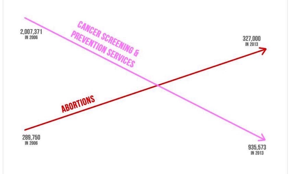
In case you’ve missed the coverage this week, there has been a lot of discussion about an enormously misleading graphic relating to the activities of an organisation called Planned Parenthood. The graphic was presented in US Congress by a Republican Congressman and was created by ‘American United for Life’. Here is the offending specimen:
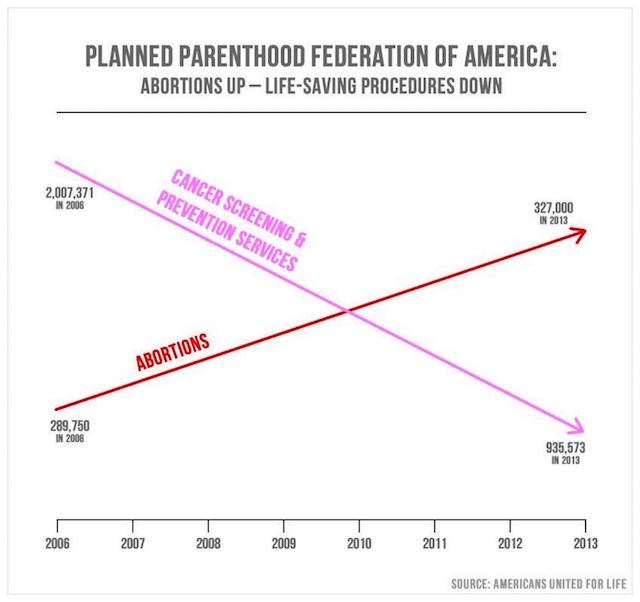
It doesn’t matter which side of the argument you believe in (I’m not close to the subject so can’t and don’t intend to offer observations about the specific issues at stake) this is a visual lie. End of discussion. Others (MSNBC, Vox, Alberto Cairo) have already covered off the necessary head-shaking commentary about how badly wrong this chart is. People like Emily Schuch have offered a helpful redesign showing what and how it should look.
My main interest in this post is in part to just to spread the word further about examples of bad practice in visualisation/infographic design. Whether intentional or otherwise, a demonstration of appalling standards like this in such a public arena is irresponsible – it has a powerfully deceptive influence. Regardless of the contention of your message, integrity and accuracy should never be compromised either in the visual or beneath the surface in the subject’s data and statistics.
Thanks to the absurd response by the those responsible for the graphic, not only are we witnessing a modern classic demonstration of the impact of visual distortions, we also have some quite outrageous attempts to defend this practice. I encourage you to read this piece on the Federalist website, defending the integrity of the chart’s message and slamming its critics.
Here are some particular lowlights:
Despite this simple reality that Planned Parenthood is Abortion, Inc. – doing one in three abortions today – activist media sites exploded in a furry [sic] of smoke and mirrors, trying to critique the visual rather than discuss the mathematical reality behind it. We should not be surprised that abortion activists in the media were worried about a picture worth a thousand of their angry words.
In a piece posted today at The Federalist, AUL Attorney Anna Paprocki addressed the misinformation in media attacks of the infographic.
The infographic in question is a simple illustration created by Americans United for Life of two trends that have undeniably occurred at Planned Parenthood under Cecile Richards’ leadership: a decrease in cancer screening services and an increase in abortions. There is nothing dishonest about highlighting those opposite trends.
For anyone that is interested, Americans United for Life has produced a huge body of work analyzing Planned Parenthood’s business model, including charts of all kinds.
Of course, there is no need to quibble over an infographic — unless you intend to miss the forest for the trees…
One shudders at the prospect of the charts they’ve made across their body of work. As Alberto commented, as a professional in this field, this kind of exemplar can’t fail to make your blood boil.