
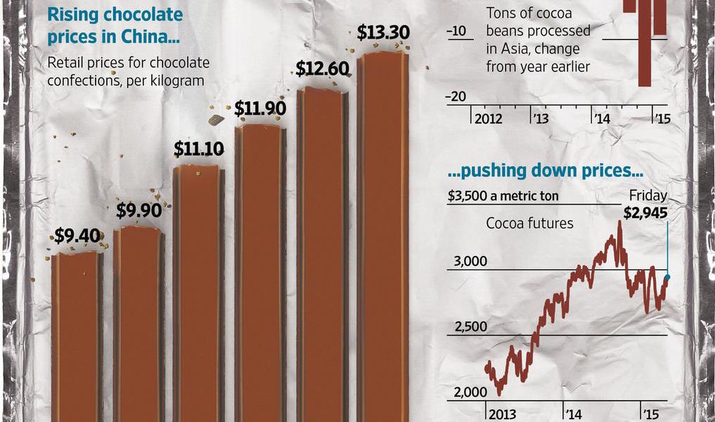
A very quick post just to share this graphic from the WSJ that was published a couple of days ago. I adore it.
I’m profiling it on here because I think this is a perfect example of an infographic that includes worthwhile and justifiable visual embellishments: useful chartjunk, if we want to go there.
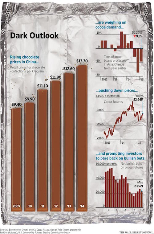
The use of the KitKat sticks to represent the bars does not distort the data but adds an extra layer of subject immediacy and attraction. The bitten off chunks are presented where the lengths/values should be (at least they look like they are). The backdrop of the carefully unfolded silver foil wrapper, the inclusion of the fragments of crumbs: we don’t NEED these devices but they are inoffensive, non-gratuitous and ramp up the aesthetic appeal.
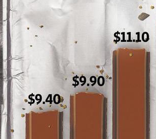
Some might term it gimmickry but for me it entirely transforms the appeal of this analysis that would have otherwise formed around largely utilitarian charts packaged up in a quite non-affecting style. There’s nothing wrong with that of course but, personally, I wouldn’t have taken a second glance at it. By contrast, I still want to eat this chart, and in my thinking that is a measure of success.