
Regular readers will be somewhat aware of my involvement in a research project called ‘Seeing Data‘, a 15 month study funded by the UK Arts and Humanities Research Council and led by Professor Helen Kennedy from the University of Sheffield.
The aim of ‘Seeing Data’ was to further our understanding about how people make sense of data visualisations. Through learning about the ways in which people engage with data visualisations our aim was to provide some key resources for the general public, to help them develop the skills they need to interact with visualisations, and also for visualisation designers/producers, to help them understand what matters to the people who view and engage with their visualisations.
We are now concluding our findings and beginning our dissemination of a range of outputs to fulfil our aims.
Understanding Data Visualisations
The first of our outputs is a resource called ‘Understanding Data Visualisations‘, a simple website created specifically for the first of those listed target audience groups, the ‘general public’ or, to put another way, people who are interested in visualisations, but are not experts in this subject.
For the majority of you out there who are already skilled, experienced and interested in data visualisation, this site will hopefully provide new information (or reinforce what you might already suspect) about how non-specialists engage with visualisations.
The site consists of a collection of modules to assist people in their role as recipients, readers, users, or consumers (how ever you wish to label the role) of data visualisations in this modern age. We want to ensure as many people as possible feel confident and capable of engaging with, reading and extracting insight from the visualisations they encounter, building up the sophistication of their visualisation literacy to maximise their understanding.
There are seven sections of content but note there is no deliberate linearity to the sequencing – you can work through the sections in any order you like.
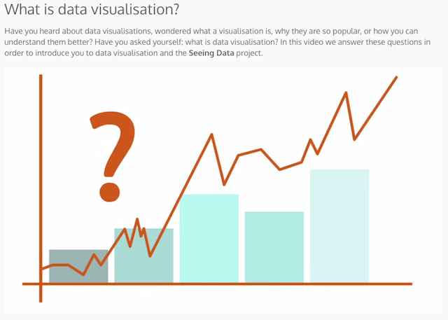
What is data visualisation?
This short video provides an introduction to the world of data visualisation.
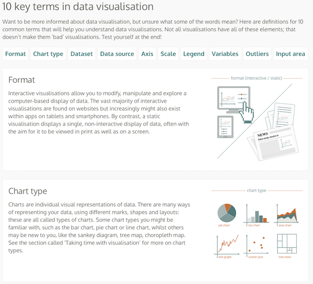
10 key terms
This section acts as a brief glossary, providing some short definitions for 10 common terms that are useful to understand about data visualisations.
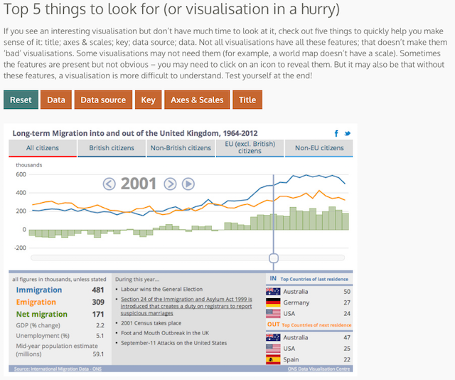
Top 5 things to look for
This section provides some advice on the tactics involved in making sense of data visualisations when you are perhaps in a hurry – you don’t have the time or setting to pore over every detail or every pixel, so these are the things for you consider for a quick engagement.
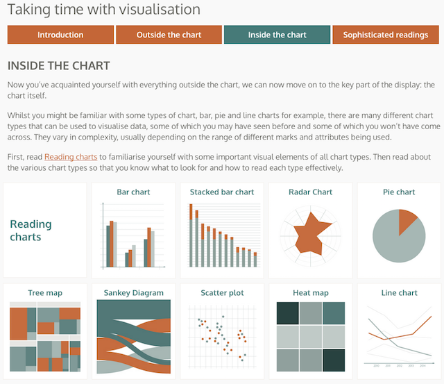
Taking time with visualisation
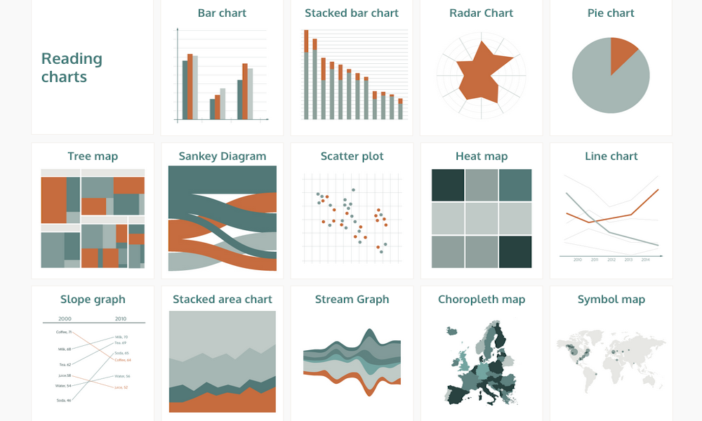
In contrast, this section goes through greater detail about the process of reading a visualisation. Whilst many data visualisations have been designed to be looked at quickly, there are times when you will need to invest more time and effort to fully understand a visualisation. This provides a sequence of pointers to go about consuming visualisations in the most efficient, comprehensive and sympathetic way. It also profiles how to read a series of common and useful chart types.
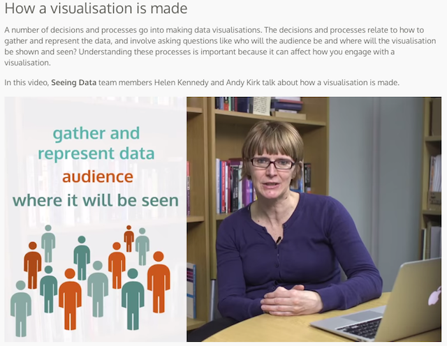
How a visualisation is made
This short video offers a perspective from creators, giving a view of some of the challenges and key decision points that go into the making of any data visualisation. Understanding these processes is important for readers/consumers to better appreciate the hidden circumstances that shape the resulting visualisation product.
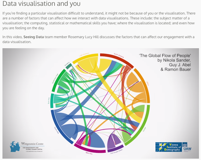
Data visualisation and you
This video profiles some of the key human factors that influence how we experience engaging with a visualisation, such as our interest in the subject matter, our current mood etc.
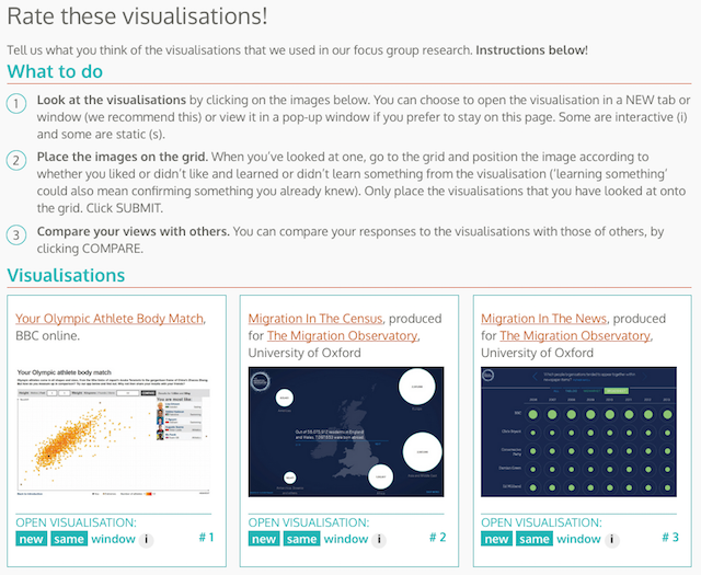
Rate these visualisations!
Finally, this last section provides an opportunity for you to take part in an interactive assessment similar to that conducted during the research process. There are 8 different visualisation works for you to evaluate based on two dimensions of assessment: whether you ‘Like’ it and whether you ‘Learn’ from it. These terms are deliberately subjective, to reflect the same kind of blunt assessments we as consumers make about any visualisation we encounter.
I will be publishing a post in the coming weeks that looks at this particular aspect of the research process in more detail.
What’s next?
We will be disseminating more findings and outputs in a range of formats (articles, papers, presentations, webinars, podcasts etc.) over the next few months that also provide information to the creators – not just the consumers – of data visualisation to give you people more assistance in how to optimise your design thinking to engage with your audiences.
To find out more about the research in general, visit the ‘About Seeing Data Research‘ pages.