
A thought for the day. Stick with me on this, I’m still deciding if there’s something in it: I will only know after I’ve published it though so here goes.
I’m musing about this visualisation work that has received a lot of love and attention on blogs and social media over the past few days. Created by the excellent people in the Wall Street Journal graphics team, it portrays data about the impact of vaccines in battling infectious diseases in the 20th Century.
The chart that has had the most impact, due to the highly topical nature of its subject, is the measles chart. This was certainly the image that was drew me in and was used to accompany the many positive tweets it received.
My question is this: do we like the visualisation or do we like the data?
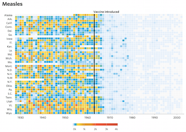
I have a few questions about the colour scheme – it is not explained what the implied threshold of the blue >> green colour means – but it is an attractive looking chart and, in using a heatmap, a suitable choice to display this data. And what a story we see! The shape of the data after the introduction of the vaccine wonderfully demonstrates evidence of its success.
Unquestionably, the visualisation reveals the findings from the data very clearly. However – and this is not a criticism whatsoever – other visualisation approaches would also have revealed this pattern (albeit most would only show an overall pattern than perhaps a state resolution). I would even maybe dare to suggest that the numbers are so compelling that you would ‘see’ the bigger picture of reduction even in a table of raw data.
So, that question again, but framed more broadly. When we like a visualisation like this is it because it is the best way, maybe even the only way, to show a certain pattern in data OR are we actually so engaged because the data that sits beneath the visual has a clear causal relationship between an action and its effect over time – the holy grail of analysis!
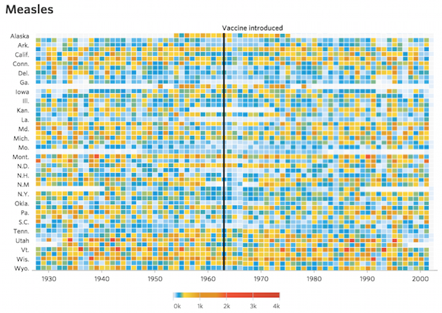
What if there was no sudden drop, as shown in the crudely photoshopped version below? Is the visualisation – the design layer – still of merit? Of course you probably wouldn’t produce the visualisation in the first place but, having lost that wonderfully clear reduction in the measle cases in the data layer, does it change our view of the design layer?
I guess it depends on your perspective and what you’re seeking to understand. Yes, I know that’s criminally boring but it is true. If you are pro or anti-vax will certainly influence your stand point on the findings but I’m kind of interested in going beyond those subject matter biases to think about how we evaluate a visualisation’s merits.
Sometimes in workshops, in one of my early class exercises, I might find myself lavishing praise on a visualisation work based on certain design features. Yet the delegates in the room, who haven’t at that stage necessarily developed such a forensic lens, are more underwhelmed by what they are seeing. They are looking through and beyond that visual surface at the patterns of data beneath and are maybe not getting much from it. It is almost like I’m so concerned with assessing the choice and quality of glass in a window I ignore the view beyond.
As a visualisation practitioner, I am often so more concerned with design choices that I rarely find myself looking beneath the design surface. For example, the discovery I treasure most from this project is the super hover action when your cursor sits above the heat map cells and a little marker appears on the colour scale to assist in reading the value. I’ve not seen (or noticed) that device being used before and think it is a brilliant little idea. Measles is going down? Yeah, great, but have you seen the hover marker!
I’ve run out of muse-momentum now so I’ll put down my pipe, and do something else other than contemplating life whilst staring out of the window. Or maybe at it.