
You work your way through the data, come up with an idea for the most interesting angle of analysis, chart your data, and delight yourself with the compelling emerging display: look how clearly it shows the difference between men vs. women! Time to incorporate some further design choices to prepare it for publishing for others…
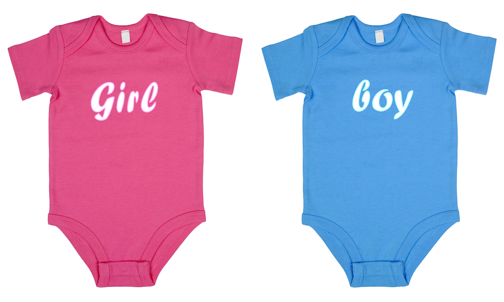
And then you come to a grinding halt: What colours should I use for the genders? Blue for boys, pink for girls. Obvious, right?
Well yes, it is so established and immediately recognisable but maybe it is, at best, overly clichéd and, at worst, patronising and offensive in its implication?
What to do!? There is plenty of discussion and increasing awareness around the significance of this issue but no real firm ‘always…’ or ‘never…’ guidance. Therein lies the nature of data visualisation, I guess.
Personally speaking I don’t always quite know how to judge the best colours to use for gender association. I generally tend to try avoid using the blue-pink but maybe in doing so I’m undermining the efficiency and readability of the things I present?
I therefore wanted to try to get closer to some sense clarity about the do’s and the dont’s, and whether or not such clarity can even exist.
Pink bus
Firstly, a little context about a topical issue relating to pink in the UK. The Labour (political) party have recently faced criticism for their ‘pink bus‘ campaign to reach out to women voters.

As you might predict the ‘lazy’ use of pink has drawn much of the stinging attention (see John Oliver’s take down in particular). Some of the defence offered by the party was along the lines that this colour is simply hard-wired in its association with the female gender.
I’ve not done tons of reading but some quick searching it seems that most sources exploring the how and why this association became established end up in a cycle of inconclusive nurture vs. nature counter arguments. I don’t think we can lean on any clarity from the past or from science either.
There are some sources that suggest that around the time of the First World War the association was actually the other way round. Boys were paired with pink and girls with blue. However, this piece seems to dispel this as most likely a myth.
Going back to the pink bus, the underlying aim of the campaign to “talk to female voters ‘around the kitchen table'” strikes me as arguably the most patronising aspect of this. As my wife astutely put it, “colour doesn’t cause the problem, people’s attitudes do”.
Some examples that go with blue-pink
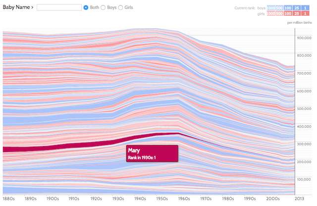
Let’s look at a couple of prominent examples of the pink-blue combination. The classic example would be Martin Wattenberg’s ‘Baby Name Wizard‘ that shows the popularity of boys and girls names over time. It sticks with the classic association of blue for boys, pink for girls.
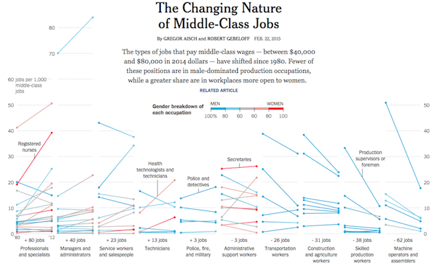
Last week, the New York Times published ‘The Changing Nature of Middle-Class Jobs‘ showing the gender breakdown of different occupations. The print version used a cyan-magenta colour, the web version used a redder version for the female category. When discussing the colour choices with Gregor Aisch, one of the authors of this work, he explained to me a critical contextual factor that influenced the final choice of colour usage:
The final argument for blue/pink is even simpler. If you want to print thin colored lines in a newspaper you have to stick to a single color tone, as otherwise the lines get blurry when printed as a mix of multiple colors (as the color plates are never 100% aligned). And in CMYK, your only real choices are cyan and magenta. In the web version I changed the magenta to something more red-ish to make the chart more readable for the color-blind.
Some examples that move away from blue-pink
So what are the alternative colour choices that people might consider using?
Change pink (part 1). The blue is still identifiable for boys leaving just one new colour for the reader to learn (but essentially they don’t have to learn as it is the only other colour).
Change pink (part 2). A darker blue that maybe shifts away from the default ‘baby blue’. Beware the association of ‘men dominating above women’ with this particular choice of layout, as well as ‘values that go under the x-axis are negative’.
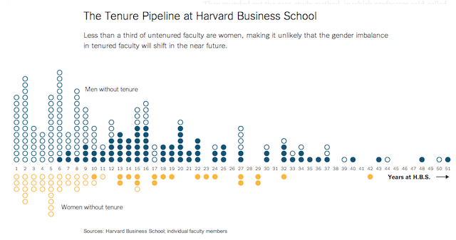
Change both colours completely. This avoids the possible negative connotation with the blue-pink meaning but means the reader has to learn new colour associations.
Switch blue and pink! Maybe this goes too far, whereby the reader may not be alert to read the colour key and misread the graphic entirely.
What do you think?
Where do you stand on the blue-pink issue? If you were a designer about to assign colours to the gender values in your chart, what choice would you make? Here is a simple 1-question poll that will hopefully allow us to discover a little more about the attitudes towards the use of colour with gender. (nb. This post is concerned with gender as a binary option. I know that is not reflective of society in 2015 but for the purposes of this post we are just focusing on male vs. female).
THIS POLL HAS NOW CLOSED, THANKS FOR TAKING PART, THE RESULTS ARE SHARED HERE.