
A quick post to share something that I’ve been really in to this past week or so: dendrochronology. Also known as tree-ring dating, it is the “scientific method of dating based on the analysis of patterns of tree rings”.
The reading of tree-rings is surprisingly fascinating (trust me) and so very relevant to the world of data visualisation.
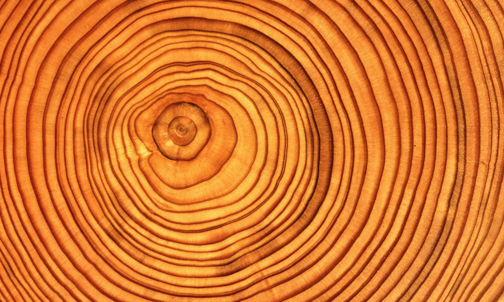
You might know about the counting of the rings but there is so much more information available than that. Through decoding the size and shapes of the ring patterns, their difference in colour, the blemishes and bulges you get to learn about the history of that tree and the conditions it experienced. It is a great example of story-deriving from visual encodings: it doesn’t tell you the story but if you are sufficiently primed to know how to read it, it gives you the details you need to piece the story together.
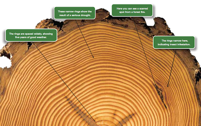
This simple graphic nicely explains how to read the tree rings and what information exists. Also, if you can bear to sit through 3m 37s of Top Gear’s James May, here’s a video that explains a little more about trees and dendrochronology.
So why is this relevant? I’ve been reading about dendrochronology for two reasons, both linked to the ‘Seeing Data‘ research project I am part of.
Firstly, I’m always alert to demonstrations of data being encoded through natural phenomena and I’ve been gathering examples for a Seeing Data project workshop I jointly delivered at a school yesterday, where we introduced a group of 13 year old kids to data visualisation.
Secondly, through working on this research – where we are primarily exploring the ‘reading’ side of visualisation literacy – I have become really interested in discovering other applications of techniques for reading and analysing things, such as reading art works or buildings. To my mind, and reinforced through our research, this it where such a big gap exists with data visualisation: not enough people are sufficiently equipped to derive enough of the insights that are being provided in the visualisation and infographics they consume.
At the end of March we will be finalising the research work and will be starting to share the findings we have derived. We will be creating outputs for workshops, presentations, webinars, articles, blog posts as well as a website resource. To keep track of it all, follow our updates on Twitter @seeing_data.