Anybody facing up to colour choices in any creative activity knows how critical such decisions can be, making a big difference between the success and failure of a design. This is amplified in data visualisation. In contrast to graphic design work, for example, there is unquestionably a greater need to eliminate or at least reduce arbitrary choices. The use of colour to decorate work or to sprinkle colours that we simply like have to be the final considerations – never the first – once all the other functional applications of colour have been implemented.
When considering these more functional applications, one of the most reliable and versatile colour options is grey (regardless of semantics about whether it is a colour or a ‘colour without colour’, see more). The advice I often give out to folks in my training workshops is to make grey your best friend when colouring your visualisation work.
Let me illustrate why with a few simple examples:
Accentuate for focus
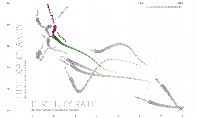
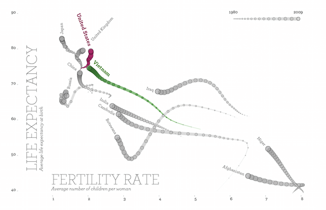
In the ‘Fertility and life expectancy’ graphic (the accidental Reindeer chart?) below, created by Moritz Stefaner in his ‘Remixing Rosling‘ project, colours are used to accentuate the US and Vietnam patterns. This highlighting effect is made possible through the relationship between the two colours and ‘no-colour’, the use of grey for all the other country plots.
Create reference for judgment context
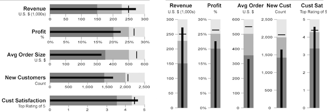
In this next display – the bullet graph conceived by Stephen Few – we see the value of grey scale in creating a reference for interpretation. Any given black bar represents a quantitative value that can be read alongside the various grey shaded background thresholds. This provides the context of meaning – is the value good, bad or average, for example.
Create reference for positional context
In a similar way, this example of Bryan Christie’s exceptional scientific illustration work uses a contrasting palette to highlight the focus on the heart. Through the use of greyscale (almost an x-ray style look) to illustrate the overall anatomy, this allows us to understand the positional context of this organ without subtracting from the focus.

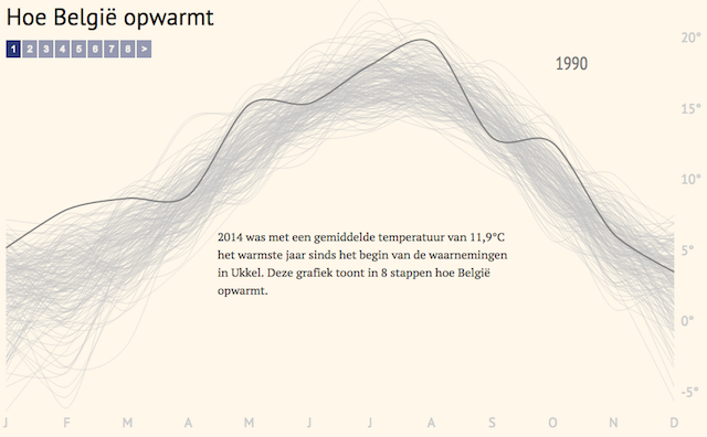
See the overall shape
In this neat multi-line chart below, by Maarten Lambrechts, we see historical readings of temperature in Belgium, one line for each year, across the 12 months of the year. There is a triple benefit in using grey in this work. Firstly, we can draw focus on a given year by hovering over a line and having colour help bring it to the forefront. Secondly, the inclusion of all data in one display for context allows to judge whether the selected series is higher, lower or typical of the rest of the dataset. Thirdly, by using a neutral colour like grey we can see the big picture – the overall shape and pattern of the data – surfacing the seasonality and spread of values, without colour getting in the way.
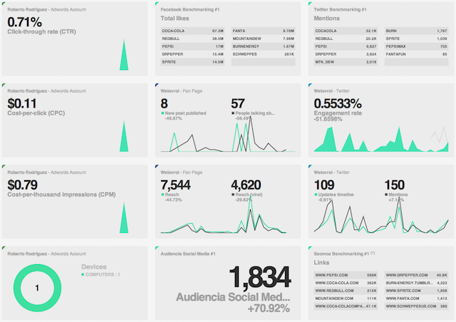
Layout organising device
This sample dashboard by Welovroi demonstrates how grey can be used as an elegant layout/organising device, to subtly separate the various panels of the display without the need for shoutier backgrounds or intrusive borders.
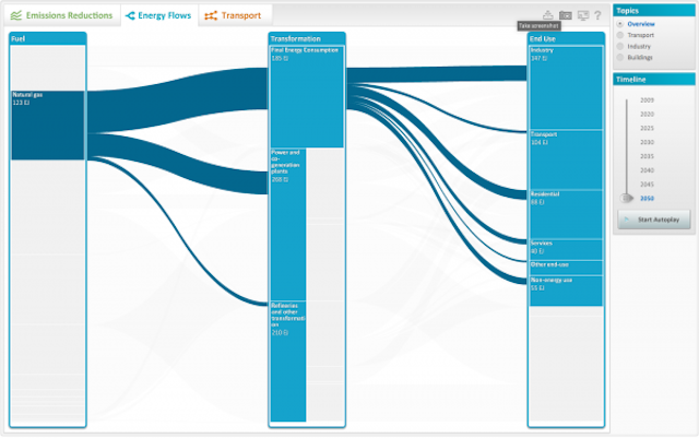
Show what is unselected
This sample interactive work by Raureif and Christian Behrens, showing energy flows, is just one of endless examples whereby grey is used to display features or values that have been momentarily unselected or excluded whilst leaving them visible for reference.
Placeholder for null
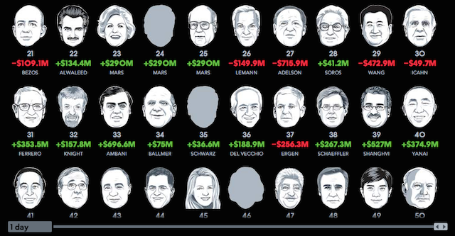
Finally, an example of using grey almost as a placeholder colour for zero or null values. In this ongoing Bloomberg Billionaires project those people for whom we have no recent photos or visual depicting how they look are presented as a grey, blank face placeholder in contrast to all the other illustrations. This in turn creates some intrigue as to why we don’t know what they look like (reclusive billionaires have a certain extra mystique…).