Ages ago I wrote an article for Wiley’s ‘Statistics Views‘ site and it looks like it was finally published yesterday. The piece is titled “Visualising Statistics: The importance of seeing not just describing data” and proposes some useful ways for exploring your data using visualisation techniques to help supplement descriptive statistics.
A few warnings:
- Hans Rosling is mentioned in line 1. I know we have long since passed the point of having to mention the significance of his work but I feel the tag line ‘the best stats you’ve ever seen’ is relevant in this discussion
- There is a word cloud included. I’m not sure really about this but on the basis that I have used it as an approach to learn about data, I threw it in there.
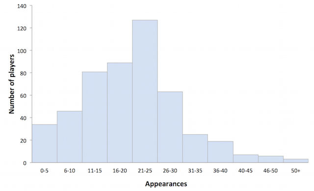
- Several of the chart types on display have made up titles. I would love to know of more appropriate labels if anyone has compelling evidence!