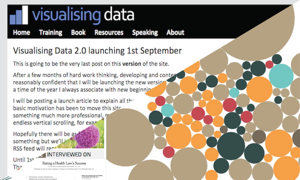
After several months of hard graft, fresh thinking, intricate development and preparation I am delighted to be launching this new and improved version of visualisingdata.com.
As I said in my previous announcement sign-posting today’s launch, September is a time of year I have always associate with new beginnings. It is therefore an exciting relief (if there is such a thing?) to be finally able to remove the ropes, hoist the sales and get this rebooted site out in the open.
Tomorrow, I’m going to post a detailed overview of the changes and some of the ideas behind this new design. In the meantime, you are of course very welcome to come in and have a play.
Four quick points to make:
- Not all the content has yet been fully migrated over in to the new site. For instance, about half of the 530 blog posts need re-configuring. More on this tomorrow but basically if you see an empty grey preview tile or a badly out of shape blog post, that’s the reason
- Not all the new content has yet been added. For instance, there are around 80 new resources and 50 references still to add into their respective new areas.
- There are still some tweaks to make to optimise the speed of the site and to fine tune the tablet/mobile versions in particular – this will be coming along in v2.01 very soon.
- Do let me know if you experience any bugs or problems. Don’t let me know if you would have done x, y and z differently – it is too soon for me to emotionally accept any suggestions like that, let me build up my strength first!
As ever, thank you for your continued interest in this site and your ongoing support. Happy browsing

