

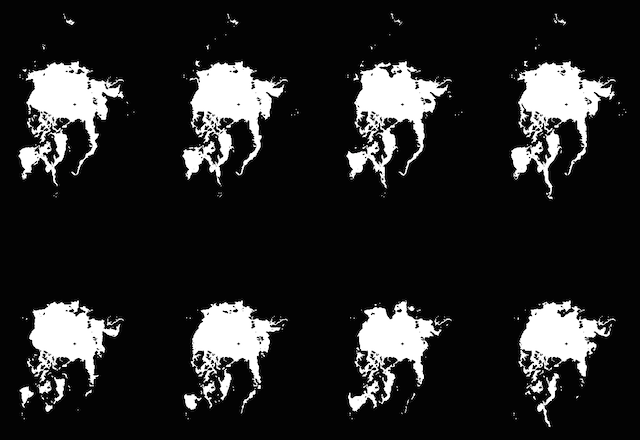
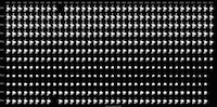
Doing the rounds on social media today is an intriguing graphic by Greg Shirah of the NASA Scientific Visualization Studio. It presents 414 images of the North Pole sea ice extent arranged in a grid of 36 years (1979 to 2014) in the horizontal and the 12 months in the vertical.
Regular readers and/or followers of my general musings will already know that I am a fully paid-up member of the small multiples fan club: if I could create small multiples for every dataset I worked with, I would. With this many components maybe we could label them micro-multiples or nano-multiples?
The timing of seeing this work was quite coincidental having discussed the merits of small multiples with this many components with delegates at a training workshop yesterday. The point I was making then, which is entirely applicable here, is that as readers we have to relax into the view, not being uptight about not necessarily being able to see pixel level detail but instead accepting the bigger picture patterns that form. Even shrunk down to just 200px wide you can still detect the shrinking patterns of the late summer period in the vertical, and the subtle but observable reduction over the 35 years left-to-right. There is also a striking gap in the imagery for the months Dec ’87/Jan ’88.
What else would you do with it?
What also struck me was thinking about what more could be done. This is not any form of criticism, simply a fascination with how much further you could take this work.
I remember fondly a couple of years ago Visualizing.org ran a visualisation ‘sprint’. This involved providing a starting visualisation and then inviting the community to develop it collaboratively in all sorts of different ways to help improve it towards an enhanced solution. More recently, Jon Schwabish launched HelpMeViz with the idea of gathering suggestions for requested improvements to sample works.
I’ve not yet incorporated this but I have been working on some new exercises in my training workshops and one of the challenges I’ve been designing involves taking a static graphic and asking groups to consider creative ways they might enhance and develop the implied starting version. The conditions are set to an ideal world context in order to get them to think creatively about different possible pathways.
For example, one thing I might do is take the shape of the largest area of arctic ice and add it to the background of each frame, probably using a subtle grayscale colour, in order to reference and compare the shrinkage in each month. This could work in the existing static form or might be better as a toggled option.
What would you do? There are plenty of folks out there with good ideas to share so, given the opportunity, what further design iterations would you incorporate? Would you change the colours? Add more annotated detail? Add layers of interactivity? Maybe create an animation? Use a fisheye zoom to see the detail of each month?
I’d be interested in hearing your ideas so drop in your comments below and let’s see the variety of creative ideas that come up!
Incidentally, here’s the high-resolution version.
