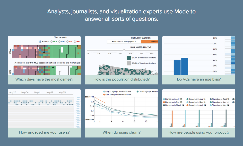
Occasionally I invite folks to contribute guest posts to profile their work, ideas or knowledge. This guest post comes from Benn Stancil from a startup called Mode who have created a really interesting tool that allows you to reverse engineer analysis/visualisations in order to potentially take them in new directions. The product was opened to the public yesterday, so you can check it out and a few examples of the visualisations that people have built with it.
Can we learn from and build on each other’s visualizations?
Like so many others, I’ve long been fascinated by learning from data–and as a result, been an avid consumer of data visualizations. The explosion of data in recent years has fueled a similar explosion of beautiful and insightful visualizations, created by everyone from industry leaders like the New York Times and Guardian to undiscovered brilliance hidden in obscure corners of the internet.
Even the best visualizations, however, rarely answer all of a viewer’s questions. We often want to understand how the data was collected, how it would look if considered from a different angle, what story it would tell if combined with other data, or how the visualization was built. In other words, great visualizations not only answer questions, but inspire more.
Unfortunately, it’s often difficult to document and share enough information to answer these follow-up questions. Creators carry the burden of sharing their data sources, their analysis that aggregated and combined data, their visualization code, and many other details. And piecing this information together after the fact is equally burdensome for consumers. The bit of knowledge someone new could add by remixing the analysis–or the bit they could learn by better understanding the original–often hits a dead-end, no matter how inspiring the visualization.
Introducing Mode
In part because of my own personal frustration, I recently cofounded a company, called Mode, aimed at providing solutions to these challenges. Mode’s mission is to connect data and the people who analyze and visualize it. We’ve built a web-based tool that executes analysis, displays results, and renders fully custom visualizations all in one place. By saving, versioning, and packaging the entire workflow together, anyone who discovers the analysis can immediately click through the results to see the underlying data, the analysis, and how the visualization was created. Right now, we’re focused on supporting SQL for analysis and web languages (HTML, CSS, and Javascript) for visualizations, though we’re planning to adding R- and Python-based tools soon.

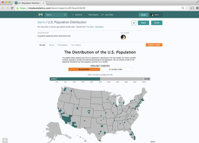
The above is a screenshot of a finished visualization. You can see the query, visualization code, and previous versions by clicking on the Query, Presentation, and Run History tabs above the graphic.
By organizing all of this information together in a simple package, people can immediately understand and add to visualizations without having to rebuild the work themselves. We’ve made this possible in one click–simply click clone on the screen above, and you’ll be working with with same visualization published by the original author, exactly where they left off.
When a piece of work is cloned, the original author not only maintains credit, but also sees who cloned their work and what they’re doing with it. This allows the community to push an analysis forward, without ever losing sight of the creator and without the creator losing sight of how their work is evolving.
Others can then working with the analysis and visualization in their own workspaces. They can even add their own data–Mode allows multiple creators’ data to be combined in a single visualization. Because all of this work happens in the browser, Mode doesn’t require setting up a development environment or finding a place to host the visualization.
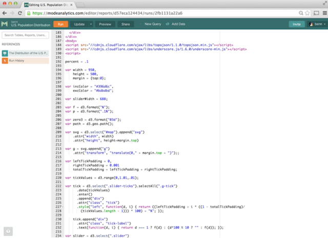
Here is a screenshot of the presentation editor, where you can add custom visualization code and preview it.

Finally, we want people to be able to easily share their work. All visualizations in Mode can be shared via URL, or can be embedded anywhere on the internet, just like a YouTube video. The embedded visualizations, like the one below, can be fully interactive, and link back to all of the data and work.
We Want Your Advice
Our approach to making data visualizations more accessible is largely influenced by our own experiences as data analysts. Surely others, who have had different experiences and objectives, face other challenges or have other ideas for solutions.
We’d love to hear what you think of our direction and how we can tailor it to your needs. What problems have you had when collaborating on data visualizations? What are your biggest struggles, and how would you solve them? If you’d like to check out our approach, Mode is free to use and you can sign up here.
We’re looking forward to see what great work people can build with Mode – and perhaps more importantly, what we can learn from each other. The world is producing fascinating data at an unprecedented pace, on subjects ranging from air quality in Chicago, to taxi traffic in Seattle, to the tattoo trends in the NBA. Great technologies for producing visualizations, like D3, Raphaël, and R, are constantly improving. And we have many giants in the data visualization community to look up to. At Mode, our hope is to help all of us stand on their shoulders.

