

I was really interested to see the Sunlight Foundation share details of its internal ‘Data Visualization Style Guidelines’ the other day.

Whilst I’ve not had chance to take a magnifying glass to the specific details of advice, I am impressed with how they have framed this document:
This guide is meant to be a starting point for creating data visualizations for this organization. “Data Series” like the 1% of the 1% may have their own twist on these foundations. Visualizations that pertain to a particular project, like the 5 year review of Political Party Time, may also have variations on these standards. Feel free to use these as a starting point, and do what makes sense for your particular data. Please remember to respect the data as you go forth into the wonderful, but often confusing, world of turning numbers into visuals.
Note the two main takeaways: This guide is a ‘starting point’ and remember to ‘respect the data’. Terrific stuff.
As well as covering the general layout, branding, type and colour identities, the guideline helpfully profiles the general dos and don’ts for several key chart types.
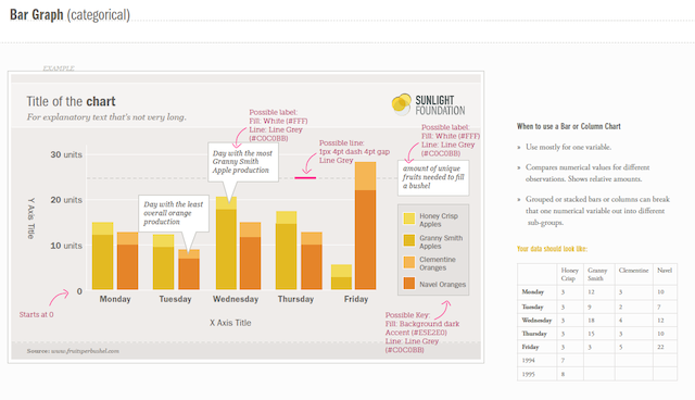
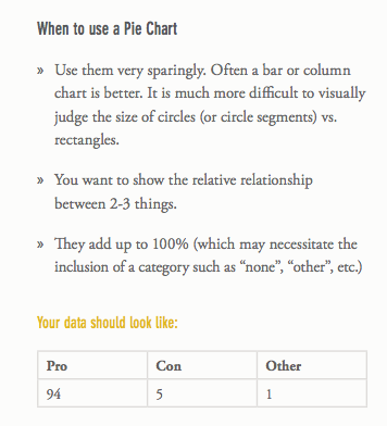
I like how they outline the use of a pie chart, with the term ‘sparingly’. The map advice, similarly, is very sensibly positioned to steer you in this direction only when the primary component of your portrayal is a geographic significance.
I’m sure this is just a starting point of guidance from which the content will mature in breadth as more and more practitioners become confident and familiar with further chart types.
I’ve seen very few of these in the public domain before, indeed only the profile of the USA Today/Column Five work springs to mind, so it is great to see this shared with the wider world.
Any organisation looking to optimise its data visualisation capabilities would be advised to consider this kind of light touch approach: something that manages to balance constructive instruction without over prescription. By taking away some of the groundwork thinking and fine-tuning design pain that many chart makers will experience, this should be viewed is a sensible development. Furthermore, it helps to create a consistent look-and-feel across the board of visual output which is often a key concern for many organisations.
Do you have an example of a visualisation style guide you can share?