
This morning I tweeted an interesting observation made on BBC News discussing the missing Malaysian airline “We are now not used to no information”. It is entirely true. In this age of so much, any gaps become so extraordinary.
I was thinking about this in another way. For those of us with the awareness and capability, the thought of not visualising data – seeing data for new degrees understanding – would be kind of unthinkable. It is easy to forget that this is not the automatic thought for everyone.
I recently heard back from Alexis, a delegate who attended one of my recent training courses, sharing a nice story about how visualising some data had made a difference to her in a small but very real way.
I have type one diabetes and I need to keep my blood glucose levels within a certain range to stay healthy and avoid long-term complications. High blood glucose levels over a long period can lead to blindness and kidney failure, among other things. Low blood glucose can make me shaky and confused. Extreme highs and lows can lead to diabetic coma, so it’s really important for me to monitor my blood glucose levels and keep them as close to my targets as possible.
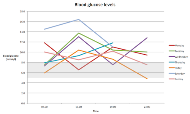
I test my blood glucose level and inject insulin four times a day – before each meal and before I go to bed. I record the results either in a written diary or electronically using an app. I need to look for patterns to see if there are times of the day when I’m high or low, suggesting I need to take more or less insulin. I’ve always struggled with numbers and find it difficult to identify patterns. After doing the data visualisation training I decided to have a go at plotting the results in a graph.
Let me pull out that last line for dramatic emphasis: ‘After doing the data visualisation training I decided to have a go at plotting the results in a graph.’
@visualisingdata Put my blood sugars in a line graph & now can see where to adjust my insulin. Who’d’ve thought graphs could be interesting?
— Alexis Bailey (@MsAlexisBailey) February 18, 2014
@visualisingdata tested 4 times a day for a week & plotted the results. Much easier to see highs & lows and take more/less insulin — Alexis Bailey (@MsAlexisBailey) February 18, 2014
The graph showed me that Tuesday to Saturday my blood glucose goes up after breakfast to well above my target range of 4.5–8 mmol/l. This tells me I need to take more insulin before breakfast to bring it down. It generally comes down in the evening and overnight so I’m not planning to make any adjustments here at the moment. I play badminton on Saturdays and go to the gym on Sundays. Exercise often has a delayed effect on my blood glucose, bringing it down the following day. This is reflected in the unusual patterns on Sunday and Monday where it dips instead of rising after breakfast.
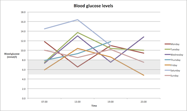
To overcome the annoying nature of Excel and time dimensions in charts, I’ve just thrown the data in a Tableau public worksheet to recreate the very same chart but make the x-axis handle four readings across the time of day rather than as four discrete values.
Here’s Alexis’ final comment:
I have to look at tables of figures for a long time before I can see patterns but this simple graph quickly gave me a much clearer picture of what’s going on. I’m going to try and repeat it every week and aim to get the lines a bit straighter, and within the target range.
@visualisingdata not joking – line graphs have improved my life! Thanks for the training — Alexis Bailey (@MsAlexisBailey) February 18, 2014
That’s a really nice story and thank you to Alexis for sharing it. Hopefully others out there will no of people in a similar situation to Alexis who might benefit from a similar simple approach to visualising their health-related data and ‘seeing it’ in a new form.
(Let me be clear, by the way, I’m not claiming the training led to Alexis’ epiphany! Instead it was her just thinking about the possibility of visualisation and being aware of what visualisation could do even in the most seemingly simple of situations. Thinking differently made this happen.)
