
It is not just the British or Seattle-ites (I understand) who have a keen interest in the Weather. Weather Radials is the latest weather-based data visualisation project from Timm Kekeritz and the team at Raureif – one of my absolute favourite agencies and creators of the excellent Partly Cloudy app.
The poster is based on a small multiples layout showing the story of four seasons of weather during 2013 across 35 cities around the globe. Each city is presented as a unique radial visualisation illustrating the weather readings and climatical characteristics across the year.
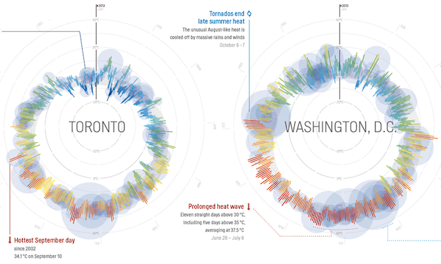
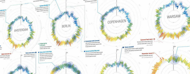
Each radial consists of 365 temperature lines with January 1 in the 12 o’clock position and the days sequencing clockwise. The closer a temperature line is positioned to the centre of a circle, the colder the minimum temperature of the day. The further out, the warmer the daily maximum temperature. The colour represents the daily mean temperature. Rainfall or snowfall is shown as a blue circle, centred on the day’s temperature line and sized according to the amount of precipitation.
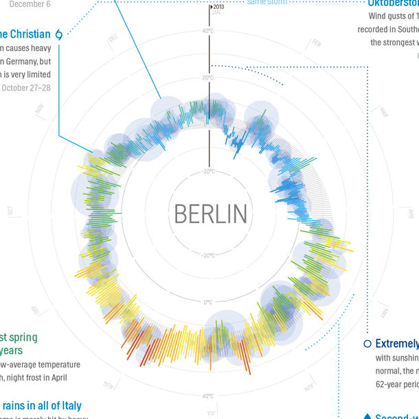
The project combines quantitative data with qualitative insights: to highlight the stories behind the raw weather data, the team hand-picked nearly a hundred weather events: extreme weather conditions, temperature records, and other meteorological anecdotes of 2013. As Timm points out these include, for example, the unusually wet spring in Berlin, the prolonged heat wave in Washington, the record temperatures in Sydney and the monsoon season in Mumbai.
The data used for the visualization was collected from the Open Weather Map project, the Norwegian Meteorological Institute and Weather Underground.
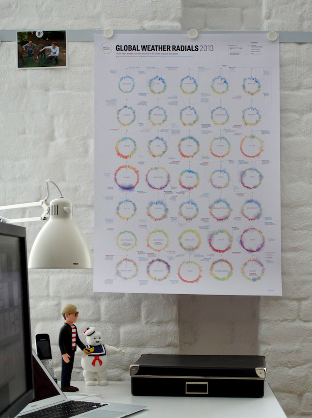
Beautiful A1-posters of Weather Radials are available to order through the website. Mr Stay Puft not included.