
Really like this work from Damien Demaj to visualise a key facet of Rafael Nadal’s incredible 2013 season on the tennis tour. Damien runs GameSetMap, a blog that presents new ways of looking at tennis analytics and tennis spatial data in particular. Damien’s recent work explores Nadal’s historic season via an interactive Game Tree.
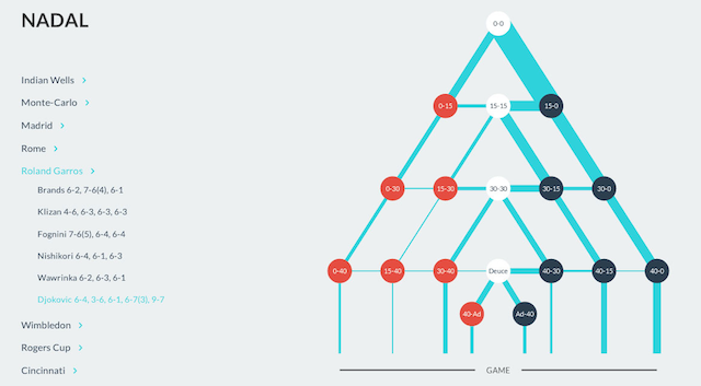
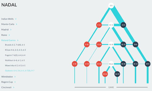
Nadal’s Game Tree allows you to explore how his 600+ service games played out in the Grand Slams, Masters 1000 and World Tour Finals. As Damien describes:
The challenge was to come up with a visualization that better reflects game momentum, and therefore shows how easily, or not a player wins their service game. Each point in Nadal’s Game Tree is colour coded to reflect the momentum in each game. Blue representing positive momentum, and red negative momentum. The spine of the game tree is coloured white indicating neutral territory for Nadal.
If it was available, I’d love to see a similar approach applied to all players on the tour, would be fascinating to see the shapes of players throughout the rankings and between genders, see how their games match up to the ideal of that right hand side path on the tree. Maybe you could compare players across small multiples of their basic tree shape? Maybe compare players in different eras?
Anyway, that’s just a personal wishlist, nice work Damien. Check out the rest of his analysis on GameSetMap.